Driving
Cost-Effective Design
Reducing time to market and cutting costs by implementing the FuseStudio design system.


Context
Fuselab Creative operates in a fiercely competitive market where clients demand top-tier experiences and deep insights into their business problems and customer challenges. Our mission is to provide lean, efficient solutions at competitive prices.
Outcome
Figma libraries and React Design System components connected to Storybook provide well-organized and accessible resources for our teams.
Challenge
We needed to overhaul our design operations, workflows, and internal tools to enhance our product design quality and efficiency. Managing fixed budgets and timelines required balancing scope, resources, and quality. We concluded that to improve our performance, we needed to enhance our SaaS and Data Visualization design system to support our 16 distributed product designers and two full-stack development teams.

Feedback
from our clients
Clients noted extended development times, high initial costs, technical challenges, scalability concerns, and maintenance demands.

Key insights
from our team
We identified issues with component libraries, low adoption rates due to inconsistent components, and significant time spent on rework.
Goal
With support and resources from the agency owners, we set out to build the FuseStudio Design System. This advanced design system will integrate the latest technologies, enabling rapid development while allowing for high customization to align closely with client business objectives.
The core goal was not to charge for the design system itself. Instead, we aimed to reallocate the time saved towards other high-value aspects of our service design, enhancing value for our clients and their customers.
My Role
As the Lead Designer and design owner, I audited our components to develop a new design strategy and structure using the latest features in Figma. The goal was to create a seamless experience for our designers and developers and improve consistency and efficiency across our products. I co-designed Figma components and worked with developers to implement them in React.js and build documentation in Storybook.
Consistency Across Platforms
Unified libraries will help identify and eliminate discrepancies, ensuring a cohesive look and feel.
Team Collaboration
Conducted an in-depth analysis of past complex projects to understand the challenges designers and developers face.
Planning
Collaborated closely with the teams to define the roadmap, plan, and execute the design.
Testing and Validation
Conducted rigorous testing and iterations based on feedback.
System Architecture
Developed a scalable architecture aligning with the company strategy of building an internal scalable product, the FuseStudio Design System.
Documentation
Created detailed documentation and guides to adopt the new design system.
Component Design
Defined the anatomy, behavior, and structure of core components, ensuring adherence to web guidelines.
Accessibility
Documented accessibility for styles, patterns, and components to ensure consistent and inclusive experiences.
Team
I collaborated with two designers to create a new design system. Effective time management was crucial as we had to balance our ongoing project work with making progress on the design system, sprint by sprint.
The process involved thorough testing of components. We assessed their quality by comparing them with screens from previous SaaS projects, which helped us pinpoint necessary improvements and create a backlog. We only considered components complete when they met our quality standards.
We worked closely with developers, sharing our work in progress and asking for their feedback and validation. This continuous review and improvement cycle ensured the components were functional and aligned with our technical standards.
Overview
- Company
- Industry
- Design Team
- Dev Team
- Design Timeline
- Dev Timeline
- Fuselabcreative.com
- Technology & Software Development
- 2 Designers
- 3 Developers
- 4 Scrum sprints
- 6 Scrum sprints
Timeline & Design Process
Putting planning into practice


Evaluation
Interviews and Evaluation
Conducted interviews with teams and evaluated past design and development components.
Definition and Roadmap
Defined the design system and created a roadmap with high-level estimations and timelines.

Figma
Backlog and Sprints
Built the backlog and worked in sprints.
Research and Design
Tackled visual design debt, designed, reviewed, and tested the components.

Development
Implementation and Testing
Implemented components in React, followed by rigorous testing and validation.
Documentation
Built public documentation in Storybook to ensure accessibility and ease of use.
Foundation
Building the Core Structure
We built FuseStudio’s core structure with semantic tokens, scalable typography, auto-layout, and interactive components, ensuring consistency, accessibility, and adaptability across all designs.
Semantic Tokens
Organized reusable colors, sizings, and radius values that can be easily applied and exported.
Variables & Styles
Created a set of variable collections designed to be easily customized and expanded.
Development Ready
Pre-configured for creating great-looking charts from day one. It is built with real code and includes all the necessary libraries.
Color System
Developed scalable color variables to ensure harmony and cohesiveness across all layouts.
Scalable Typography
Established a flexible and bulletproof typographic scale optimized for readability.
Spacing System
Implemented a ready-to-use progressive spacing scale to avoid manual calculations.
Auto Layout
Ensured all components grew to fill or shrink to fit when resizing and reflow as their contents changed.
Accessibility in Mind
Adhered to Web Content Accessibility Guidelines (WCAG) 2.1 Level AA, with colors using APCA and synced to swap tones from the palette easily.
Interactive Components
Added delightful interactions to the helpers and components to empower designers to create advanced prototypes.
Component Excellence
Utilized the right naming conventions and consistent structure, allowing components to retain overrides and enabling faster iteration.
Scalable-Grid System
Structured on 4-column, 8-column, and 12-column grids, with all spacing and sizing measured in increments of a 4pt base unit.
Dark & Light Modes
Using variable tokens, all components were configured to include dark mode. These variables work automatically, adapting to any new project needs.
A system within a system
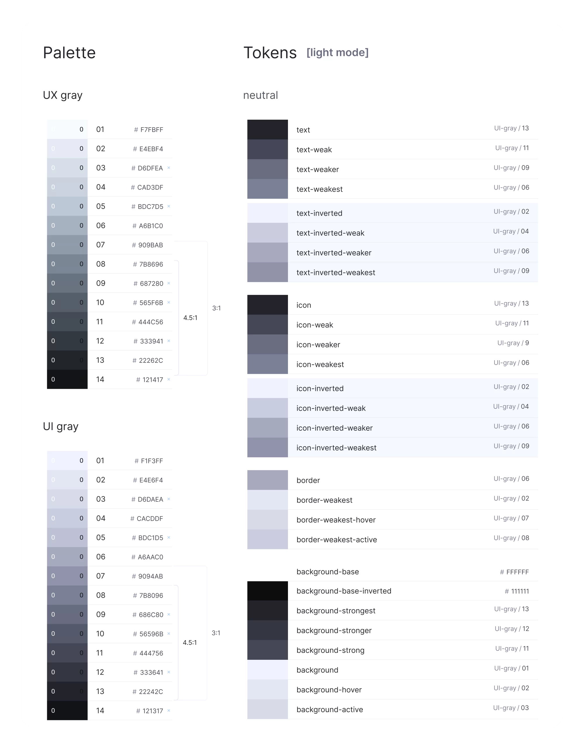
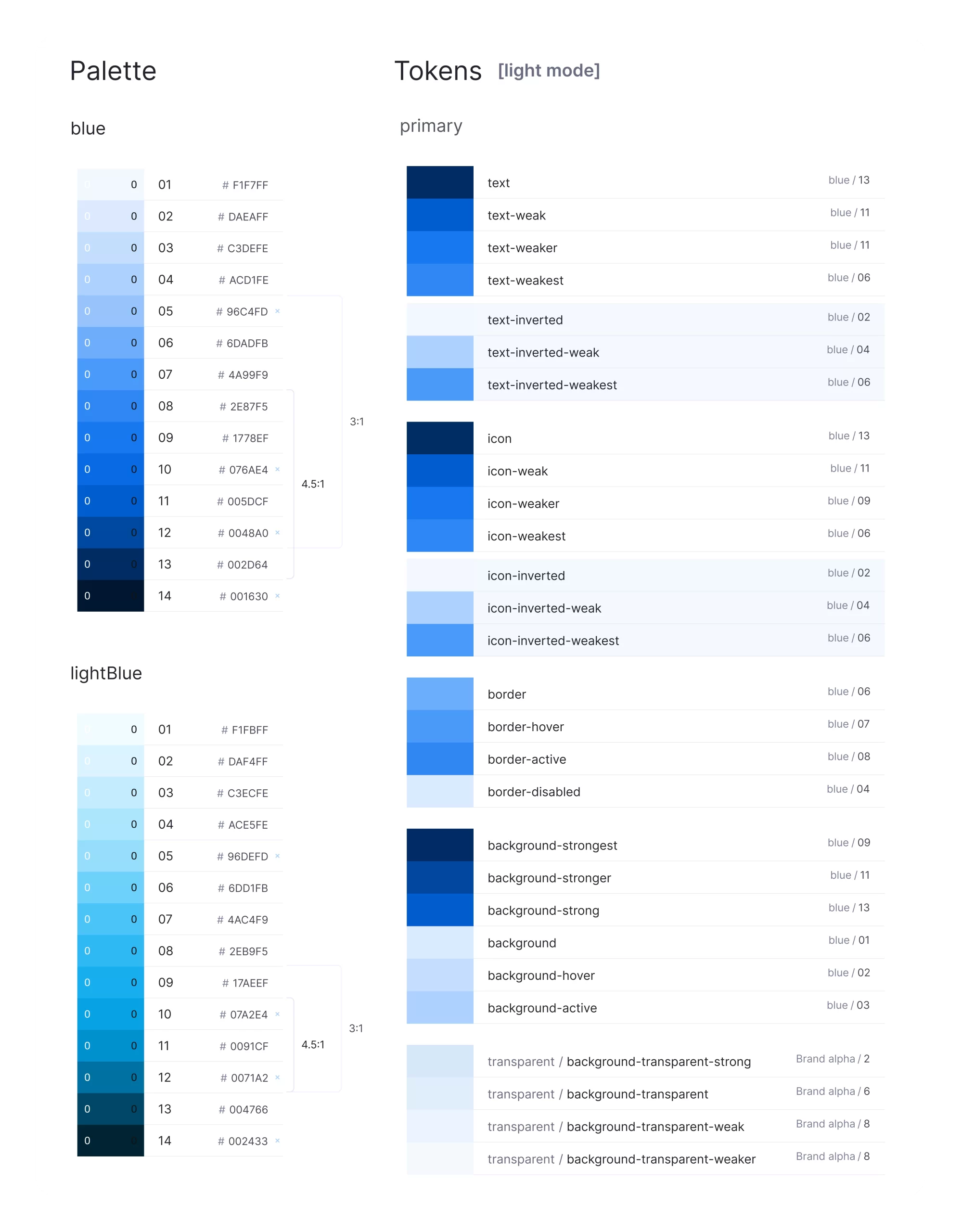
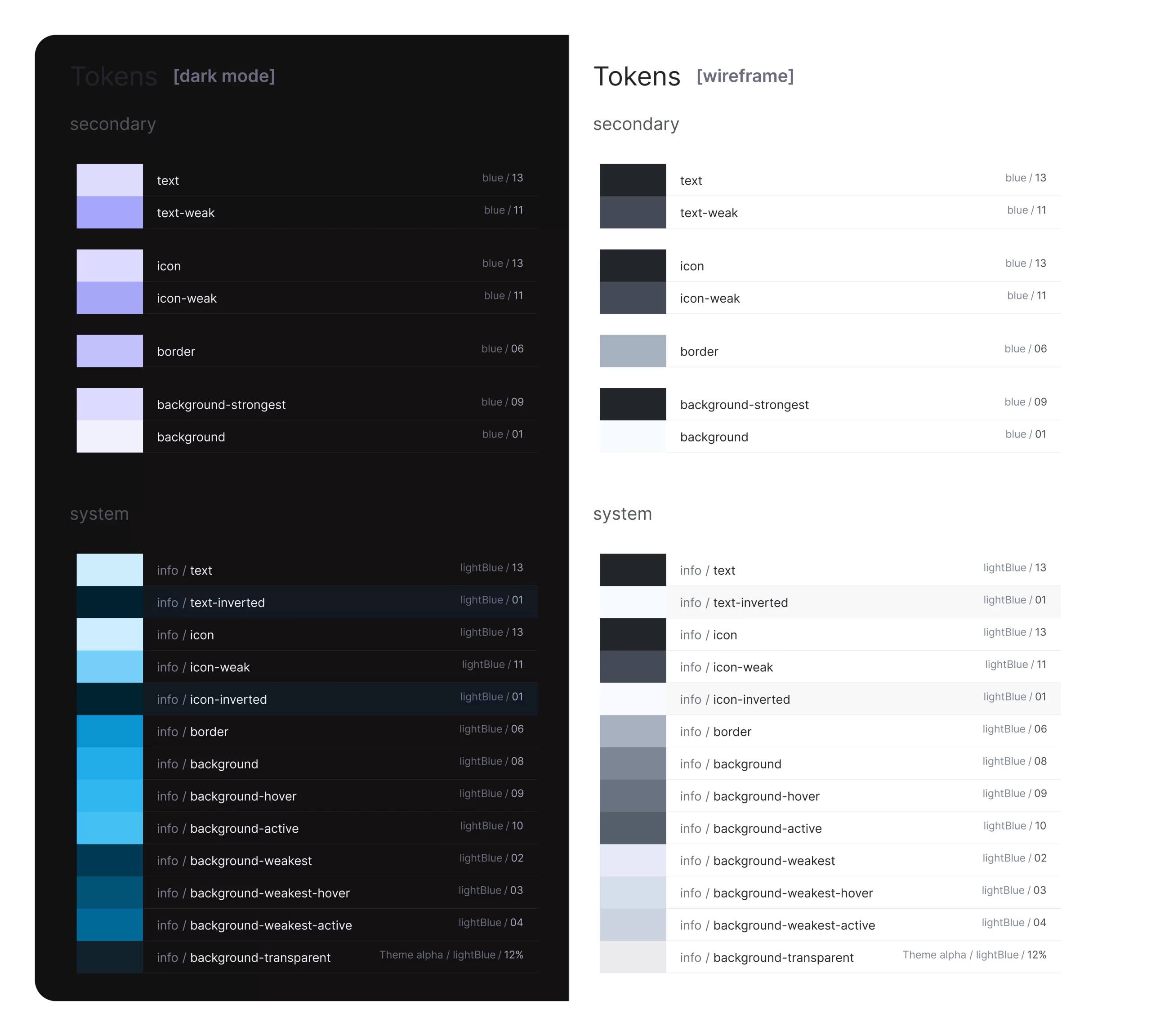
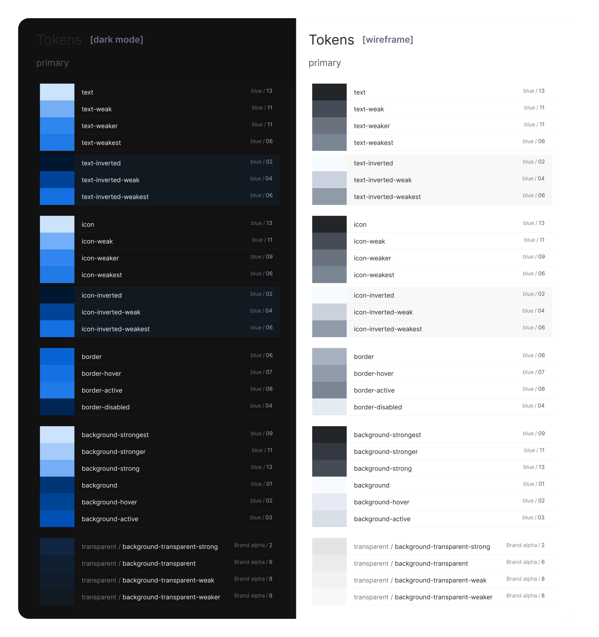
Colors
as Variables
We have implemented a color token system with light and dark modes, alpha variations, and well-defined text and icon colors to ensure consistency and adaptability across themes.
Colors
Our design system is built on a core palette of primary, secondary, and neutral colors. Semantic color tokens linked to this palette ensure cohesive visuals for text, backgrounds, and borders. We implemented light and dark themes for readability and created alpha variations for depth. Neutral and inverted colors were defined for text and icons, maintaining visual consistency.
Deliverables
Figma
React.js
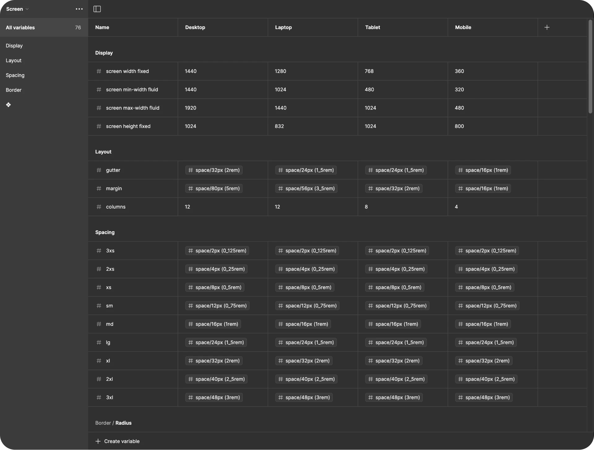
Grid System
We structured the grid system to support responsive layouts:
Adaptive Grids: Implemented 4-column, 8-column, and 12-column grids with all spacing and sizing measured in increments of a 4pt base unit.
Flexible Layouts: Ensured the grid system adapts seamlessly to various screen sizes and devices.
Deliverables
Figma
React.js
Spacing System
Our spacing system ensures uniformity with default, wide, and condensed spacing values, reducing manual adjustments. Here’s how we structured the key spacing variables:
Set standard spacing values for most components to ensure consistency and minimize the need for manual adjustments.
Increased spacing for layouts that need more white space, creating a more open and airy design for better readability and visual appeal.
Reduced spacing values for a more compact design, maintaining a neat and efficient layout without compromising on usability.
Deliverables
React.js
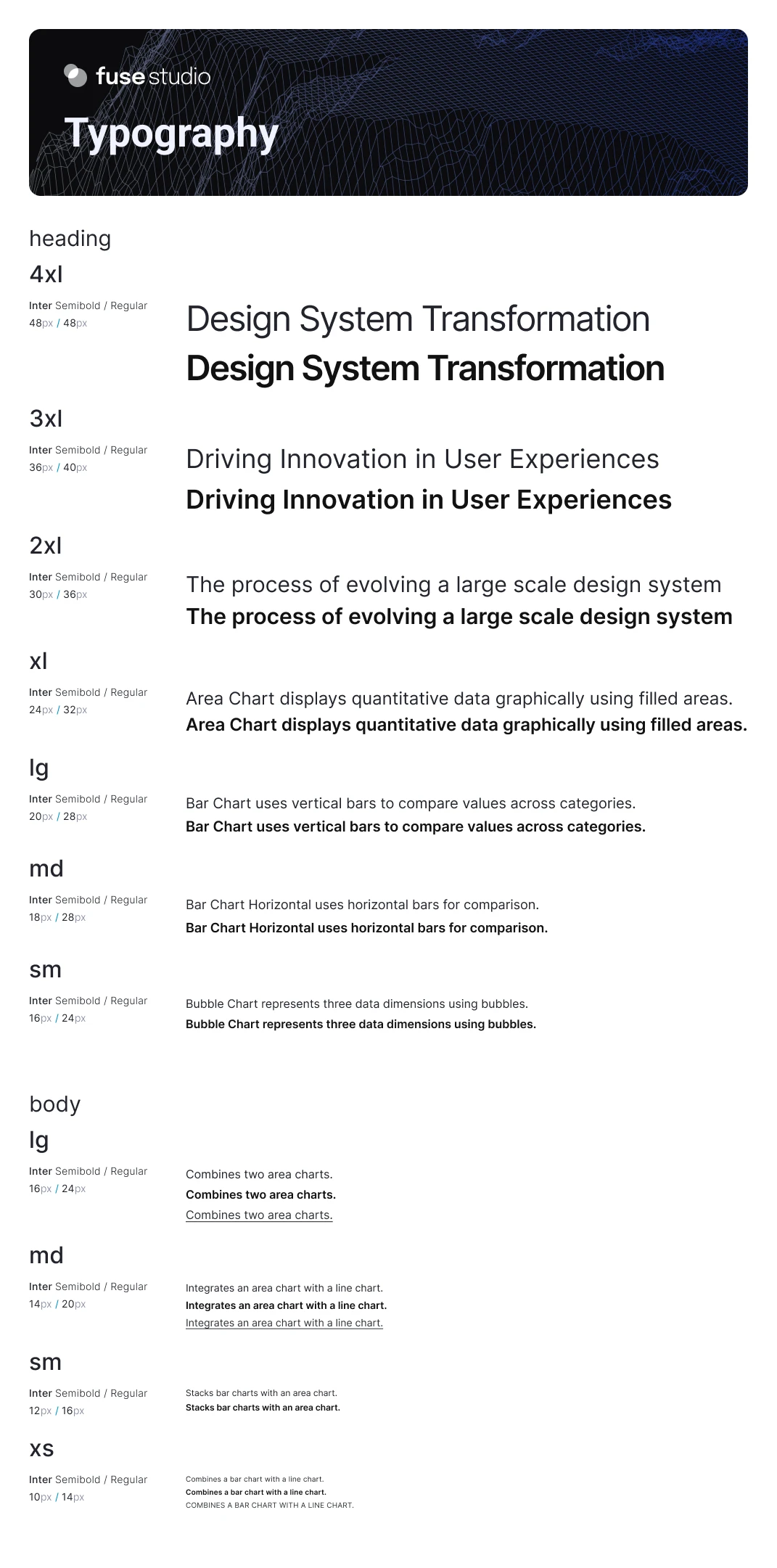
Typography
We use Inter for headlines and body text, which is customizable to brand fonts, ensuring readability and a cohesive look. In this project, we’ve embraced a distinctive approach to naming fonts, fostering a conditionally independent system.
Deliverables
Figma
React.js
SaaS Components
Device-agnostic
Our design system features a robust suite of components that streamline development and enhance user experience. Each component is meticulously crafted to ensure consistency, accessibility, and efficiency, enabling faster time-to-market and superior product quality.


Data Visualization Components
Customizable visual solutions for complex data
We have developed highly flexible custom charts, enabling designers and developers to create versatile solutions. Prioritized categories and plot components, including lines, bars, circulars, and diagrams, emphasize readability and quick comprehension. All of these are well-documented in Storybook.
Lines
Line charts illustrate trends and changes, helping identify patterns and insights.

Area Chart
Displays quantitative data graphically using filled areas.

Area Chart Stacked
Displays quantitative data graphically using filled areas.

Line Chart
Connects data points with straight lines to show trends.

Line Chart Stacked
Stacks multiple line charts to compare different data series.
Bars
Bar charts are essential for comparing different groups or categories, making it easier to see differences and similarities.

Bar Chart
Uses vertical bars to compare values across categories.

Bar Chart Grouped
Groups bar charts are used to compare multiple categories.

Bar Chart Horizontal
Uses horizontal bars for comparison.

Bar Chart Stacked
Stacks bars to show cumulative totals.
Combo
Combo charts combine multiple chart types, providing a comprehensive view of data.

Area Chart & Area Chart
Combines two area charts.

Area Chart & Line Chart
Integrates an area chart with a line chart.

Bar Chart Grouped & Lollipop Chart
Combines grouped bar charts with a lollipop chart.

Bar Chart Stacked & Line Chart
Combines stacked bar charts with multiple line charts.
Circulars
Circular charts visualize data in a circular format, highlighting parts of a whole.

Bubble Chart
Represents three data dimensions using bubbles.

Donut Chart
Displays data in a circular format with segments representing parts of a whole.

Pie Chart
Shows proportions of a whole using pie slices.

Radar Chart
Presents multivariate data with axes originating from a common point.
Diagrams
Diagrams offer unique data visualizations, often combining multiple dimensions into a comprehensive view.

Heatmap
Represents data values using a color matrix to highlight areas of interest.

SankeyPlot
Visualizes the flow and distribution of resources or data.
From Design to Development
Bringing It All to Life
Transformed design components into functional solutions using React.js, enhancing efficiency and customization.
FuseStudio integrates accessibility, modern technologies, and robust documentation to support seamless development.
React components
Integrates standard SaaS and unique data visualization components into projects, expediting development and enhancing flexibility.
Accessibility and Naming Conventions
Built on Consistency, Clarity, and Meaning principles, our libraries follow industry best practices, ensuring seamless and intuitive developer experiences.
Modern Technologies
Leveraging React.js, FuseStudio constructs projects on modern, efficient platforms, enhancing performance and future-proofing solutions.
Customization
FuseStudio’s robust foundation allows high customization, tailoring solutions to meet unique business needs and aligning with business goals.
Scalability
Inherently scalable, FuseStudio grows with your business, ensuring seamless software expansion without requiring complete overhauls.
Quality Assurance
We prioritize high-quality development with built-in best practices for testing and assurance, ensuring reliable and robust software solutions.
Accessibility
Defined the anatomy, behavior, and structure of core components, ensuring adherence to web guidelines.
Documentation
Comprehensive documentation integrates accessibility into the core process, covering styles, patterns, and components, reducing inconsistencies.
ROI
Boosting ROI with Design System
Implementing FuseStudio’s design system brings significant returns on investment by enhancing team efficiency, scalability, and overall project success. Here are the key metrics demonstrating the impact.


Reflections
What I learned
Building a design system has been a growth journey for the entire design team. Here are the key takeaways:

Challenges and Growth
Tackling the complexities of building a design system improved our skills. Adjustments required thorough testing and communication.

Collaboration and Cohesion
Syncing the developer’s Storybook and the designer’s design system is crucial. Regular meetings and shared documentation ensure a unified effort.

Technical and Process Improvements
Comprehensive documentation reduces inconsistencies. Prioritizing accessibility from the start sets a solid foundation for adherence to standards. Yet, office hours will increase success since it is all about communicating live and answering questions.

Personal and Team Growth
The project required resilience and adaptability. Enhanced communication skills were crucial for success. This project empowered the team to learn and grow, boosting our confidence and understanding of building a design system.