Design System Transformation
Creating a scalable framework for design processes to adapt and grow with the organization’s needs.


Background
At Crunchyroll, enhancing user experience is a top priority, driven by customer feedback and evolving market trends. Implementing new features while maintaining existing functionalities is a significant endeavor that incurs high costs.
Revamping our Design Systems into a scalable, cross-functional solution was critical to maintaining profitability, ensuring timely delivery, and allocating time for innovation and experimentation.
Goal
In early 2020, while the org decided to redesign all Crunchyroll applications, I proposed the creation of a Unified Design System to the leadership. To achieve the following objectives, the goal was to develop a comprehensive design system for all Crunchyroll platforms, including web, mobile, and 10-foot experiences.
Challenge
Developing a new design feature with mid-to-high complexity end-to-end for one platform requires two designers working full-time for eight scrum sprints. Due to the complexity of the flows, user journeys, and amount of screens we designed, we had to narrow down experiments, explorations, and UX research to deliver according to the org’s timeline.
Without
Unified Design System


I evaluated several past projects across platforms, had round-table discussions with designers, and concluded that inconsistent and outdated components and development support for redundant problems significantly impact designers, taking away time from experiments and testing.
My Role
The Design System was positioned as an internal tool, and I adopted a startup mentality to drive its development. My team and I wore multiple hats, covering various responsibilities, including roadmap planning, sprint backlog prioritization, ticket requirement writing, and co-designing components. Additionally, I documented the library for designers, product managers, and developers to ensure clarity and ease of use.
Key Responsibilities
Overview
- Company
- Industry
- Team
- Stakeholders
- Timeline
- Crunchyroll.com
- VOD
- 2 Designers
- Product & Development
- 2020 – 2022
Deliverables
Product Discovery, Roadmap, Research, Audit, Product Requirements, Information Architecture, Styles,
Tokens, Components, Documentation, Accessibility, Usability Test
Team

I led a team of two full-time designers dedicated to the design system project. Depending on the project’s demands, I occasionally enlisted platform designers for specific sprints to provide additional support.
Design Process
We needed a platform-agnostic, cross-platform design system that is easy to use, maintain, and sync with code. Developing a successful design system requires a solid foundation, including establishing the token architecture, sub-systems, and foundational styles and fostering team relationships.
Laying the Foundation for a Unified Design System
Before creating the Unified Design System (UDS), it was essential to understand our platforms and identify critical issues and user needs. To ensure a structured and efficient implementation of the UDS, I forecasted the required effort and developed a detailed roadmap.
Analyzing Existing Designs
Carefully studied existing designs on all platforms to find inconsistencies and areas for improvement.
Engaging with Stakeholders
Gathered valuable feedback from our team members to ensure the design system would be well-received and highly functional.
Effort Estimation
Detailed job breakdowns and high-level estimations for each UDS library.
Resource Allocation
Secured leadership approval for resource allocation.
Milestone Planning
Developed a detailed roadmap outlining the scope, effort, resources, and milestones.
Securing Leadership Approval
Conducted workshops and discussions to refine and approve proposals with leadership feedback.
Finalizing the Roadmap
Finalized the roadmap with leadership approval.
Phased
Implementation
The implementation of the UDS was executed in well-defined phases to manage complexity and ensure quality.


Phase 1
Design System
This phase laid the foundation for implementing a consistent and scalable UDS, including typography, colors, logos, iconography, and spacing.
Phase 2
Platform-Specific Integration
To update the LRX, Web, and Mobile design systems with UDS components, customizing each platform to ensure smooth integration.
Phase 3
Front-end Development
The final phase required updating development files for Web, iOS, Android, and 10-feet platforms with UDS components, ensuring consistency throughout all platforms.
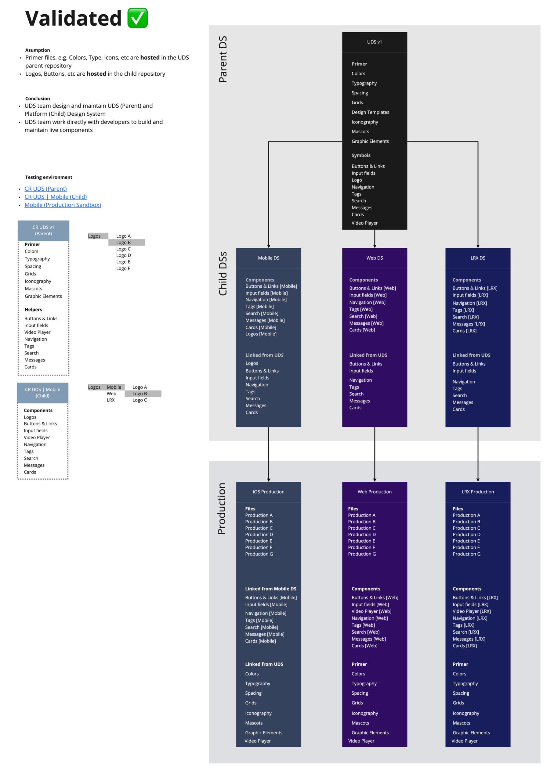
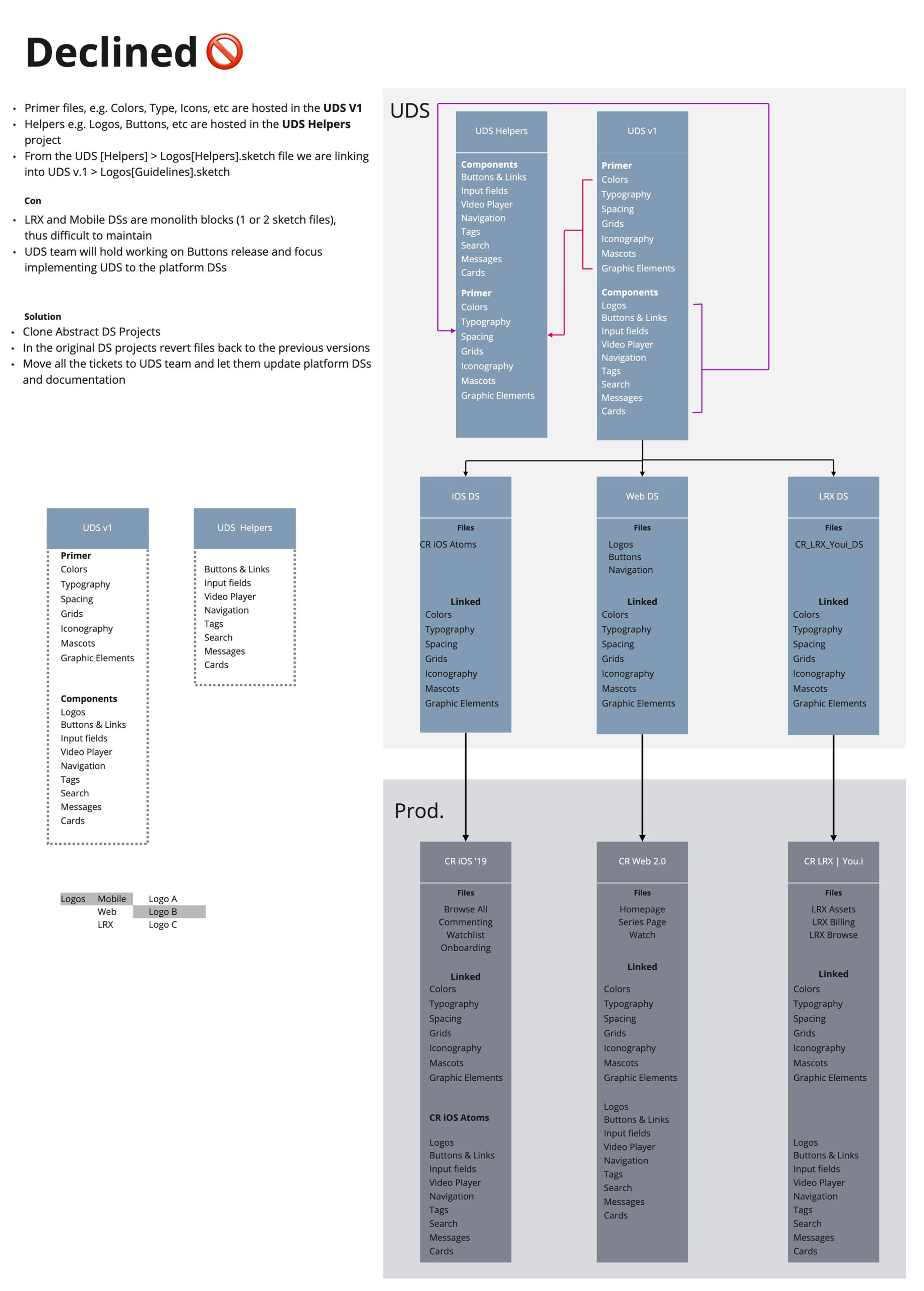
Hypothesis
Initially, we aimed to host all Unified Design System (UDS) components, but this approach limited flexibility and scalability. We realized that having a single design system encompassing everything was not feasible.
UDS
The primary design system hosted shared components that set the foundation for platform-specific design systems. It includes:


Platform Design Systems
Referenced the primary UDS libraries for web, mobile, and 10-foot experience platforms, creating platform components and using tokens, additional styles, and documentation to ensure adherence to guidelines.


Primary and Platform
components ≠ One Design System
Benefits of the
Unified Libraries
Consistency Across Platforms
Unified libraries will help identify and eliminate discrepancies, ensuring a cohesive look and feel.
Scalable Typography Grid
Introduce a flexible and scalable typography grid to maintain visual consistency across all devices.
Centralized Assets
Move mascots and graphic elements from disparate storage locations to a dedicated library, fostering creativity and efficiency.
Accessible Documentation
Make documentation accessible to the entire organization, ensuring transparency and ease of use.
Streamlined Development
Improved production design and consistent development implementation.
Flexible Design Components
Create and foster new libraries, enabling teams to innovate while maintaining consistency.
Enhanced Collaboration
Facilitate better communication and workflow between design and development teams, leading to more cohesive project outcomes.
Faster Iterations
Enable quicker design iterations and updates, allowing for rapid response to market changes and user feedback.
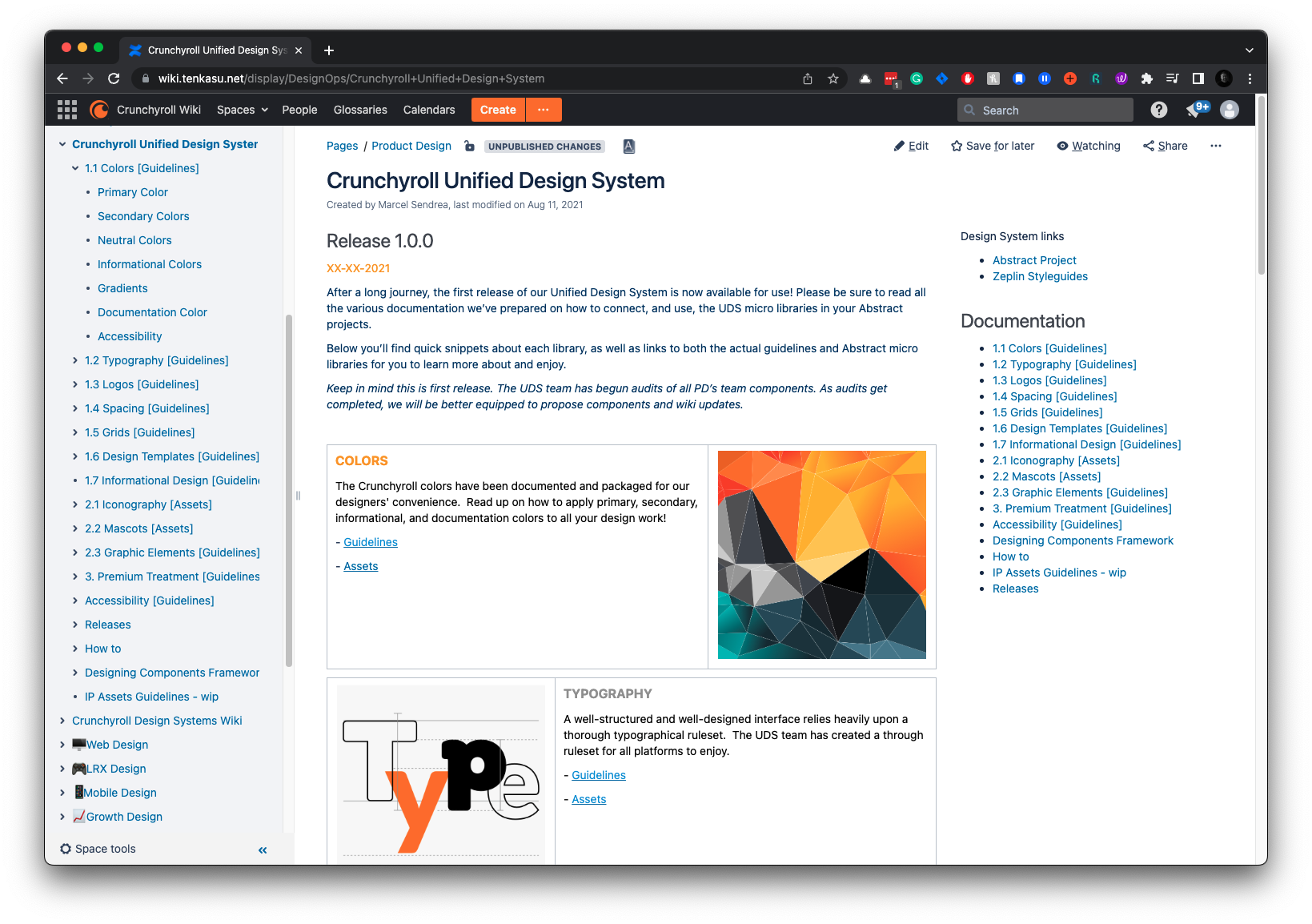
Styles & Tokens
The design token architecture was developed closely with engineers to ensure alignment with the codebases. Initially, we used Sketch and Zeplin for this process. As I was transitioning out, we began migrating from Sketch to Figma. The current release of UDS is built in Figma and utilizes all the app’s bells and whistles features.
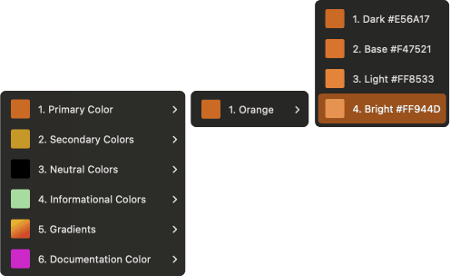
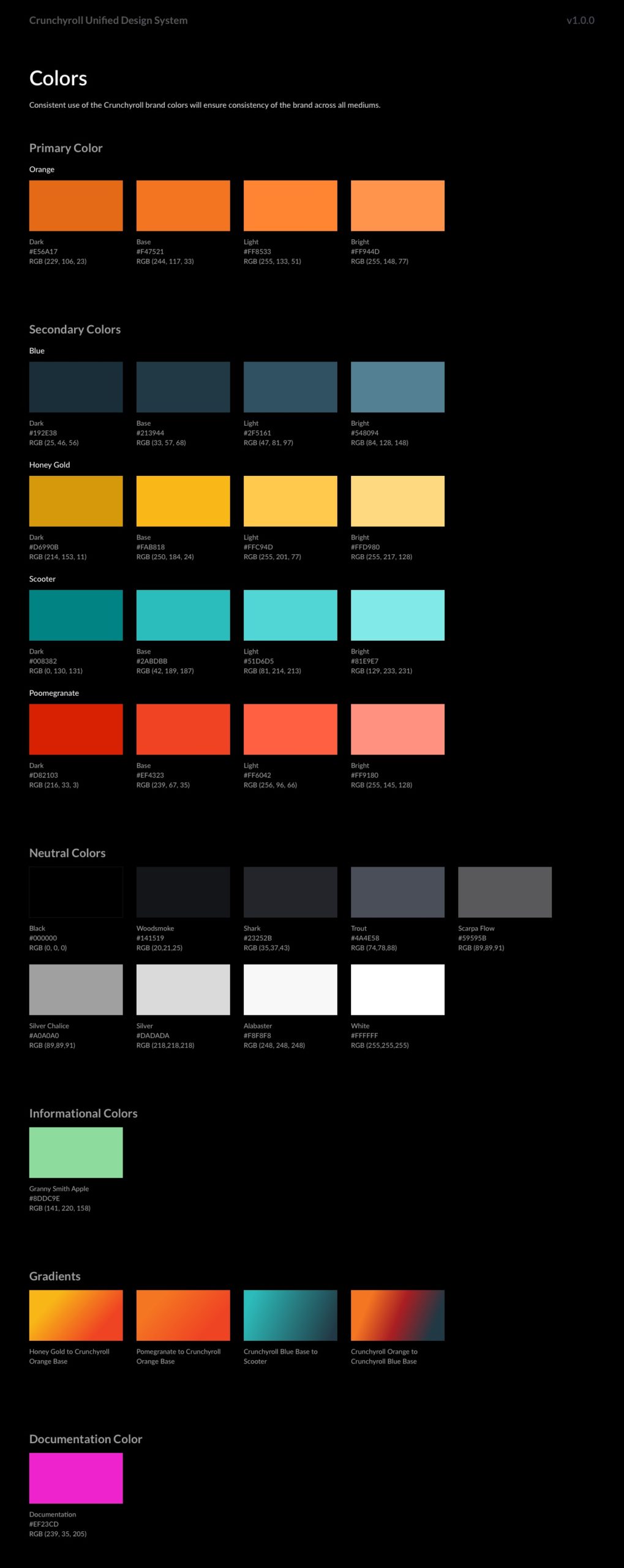
Colors
Creating a scalable color system ensured consistency and flexibility across all Crunchyroll platforms. We developed a comprehensive color palette with design tokens to manage colors efficiently. This allowed for easy updates and ensured our color usage was consistent and accessible.
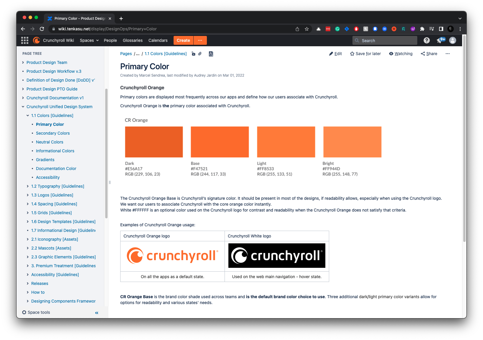
Primary
Maintaining brand identity across platforms required a consistent color palette. Our primary color is Crunchyroll Orange, with dark, base, light, and bright shades thoroughly tested for accessibility and visual impact.
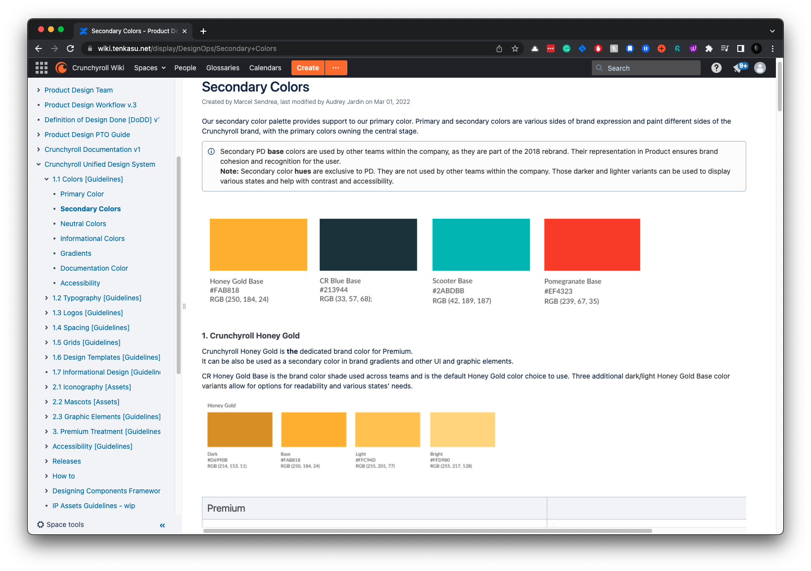
Secondary
Creating a versatile secondary color palette was vital to complement our primary colors and allow flexibility in design. It includes dark, base, light, and bright shades.
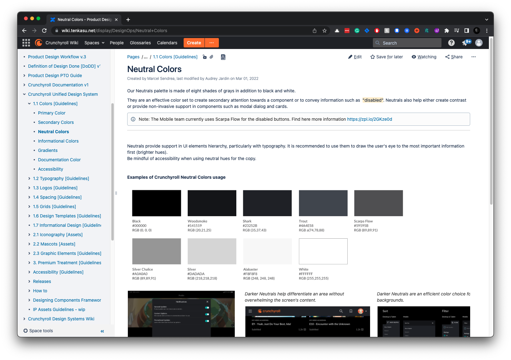
Neutral
Neutral colors are essential for creating balance and focus for typography. They provide a backdrop that allows primary and secondary colors to stand out.
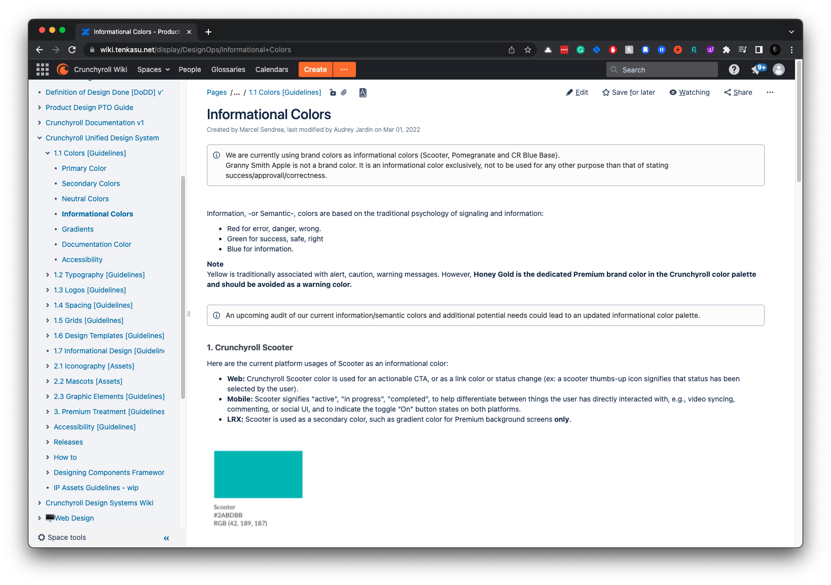
Informational
Informational colors convey status, alerts, and feedback to users. Users rely on them to understand the application’s state and any actions they need to take.
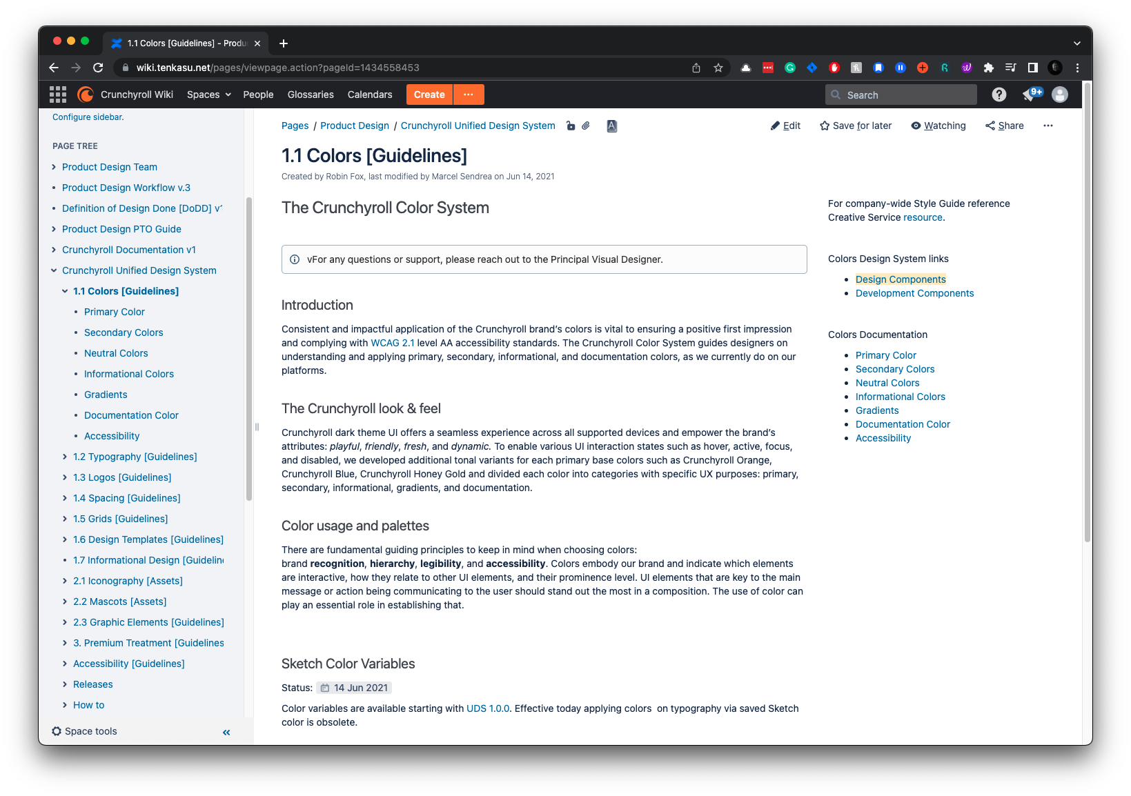
Colors Documentation
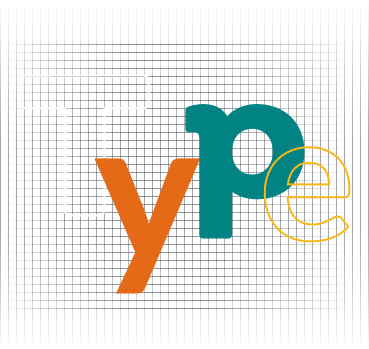
Typography
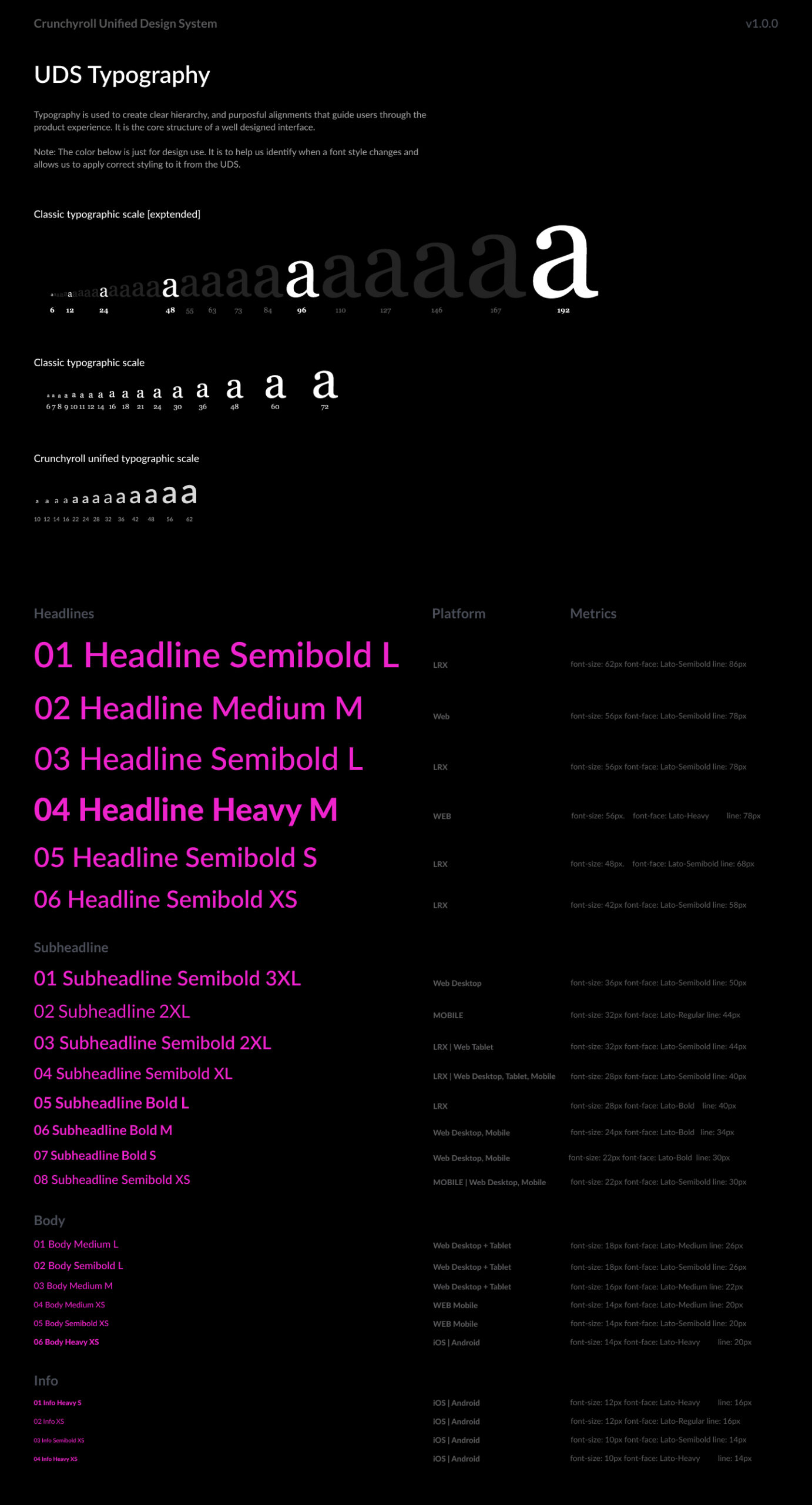
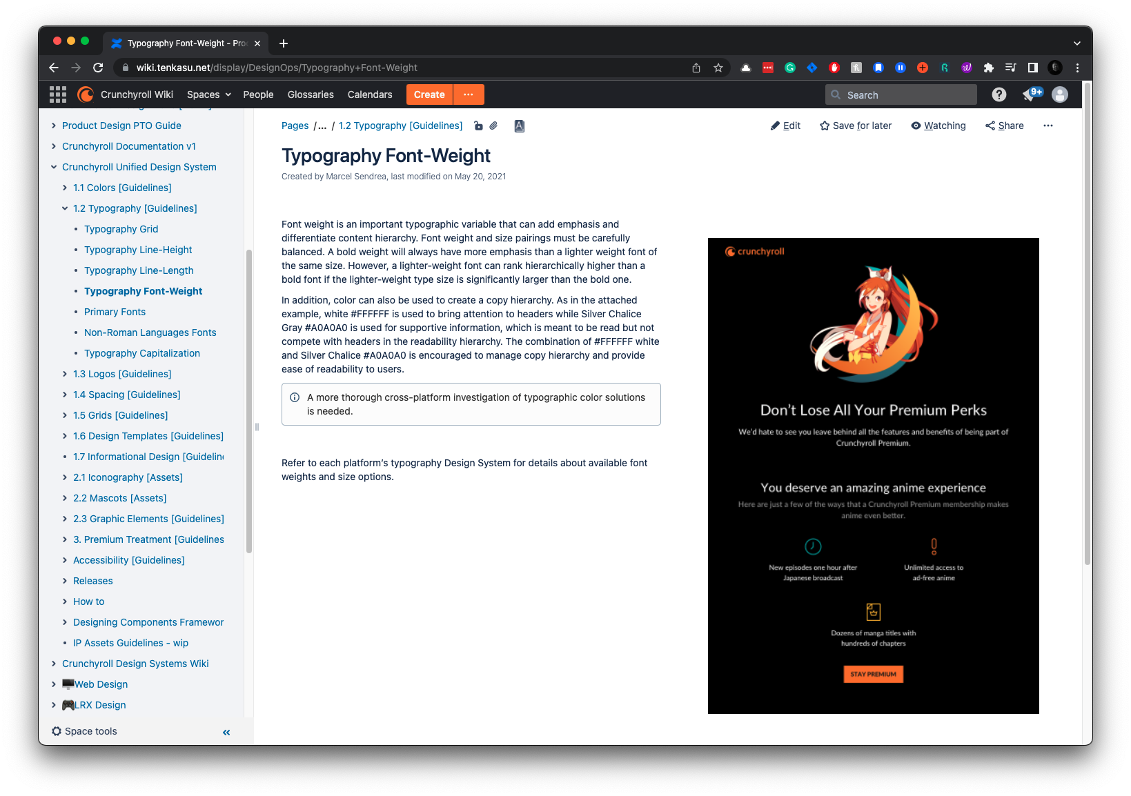
Creating a scalable typography grid was challenging. I built an elastic grid to scale font size, line height, and font-weight across platforms. Collaborating with the UDS team, we integrated feedback from stakeholders to refine the grid.
The UDS Designers tested it on real, past designs launched across platforms, establishing a pattern of real-environment testing for all components. This ensures practical and user-centric design solutions.
Font Size = Base Size + (Ratio × Step)
Line-Height = (Base Size+(Ratio × Step)) × Line-Height Ratio
Typography Documentation
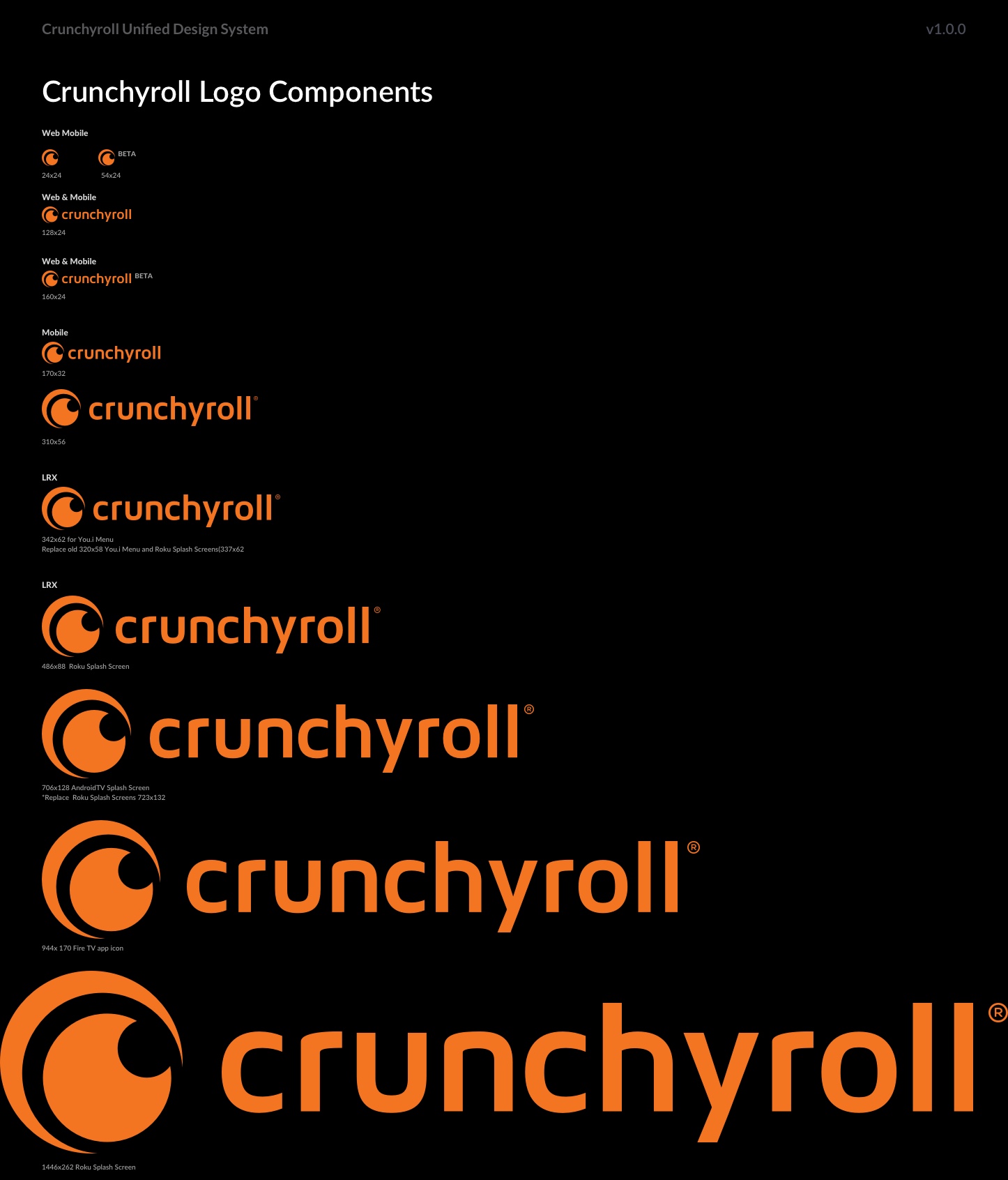
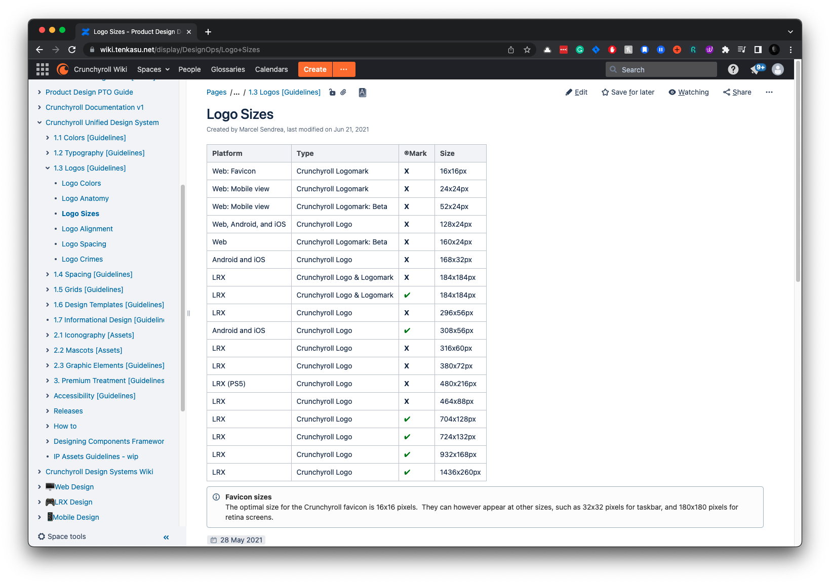
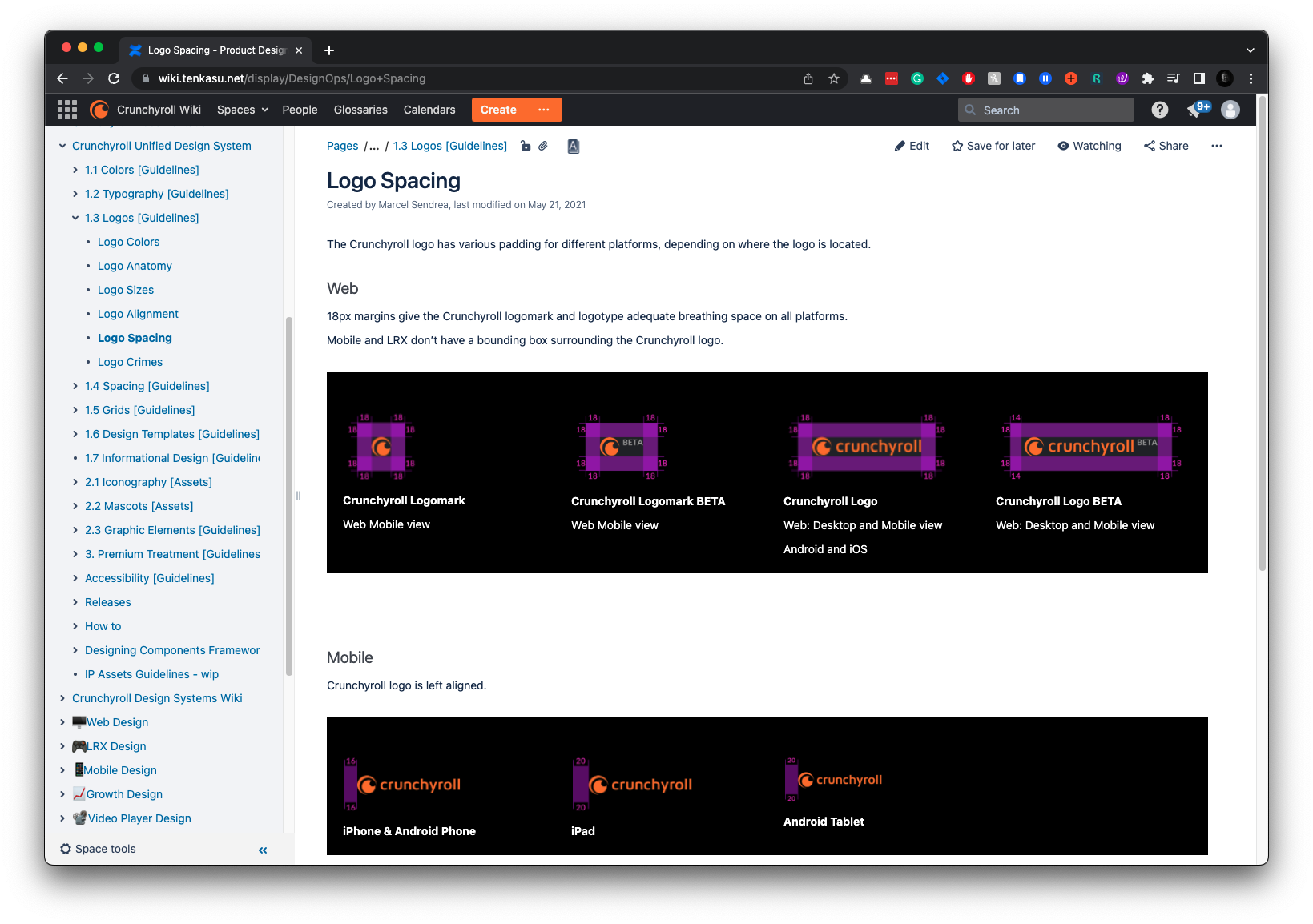
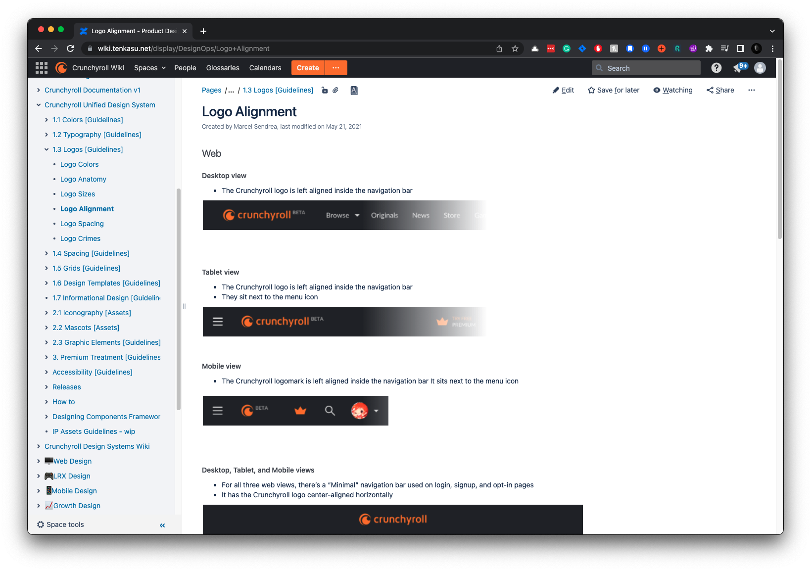
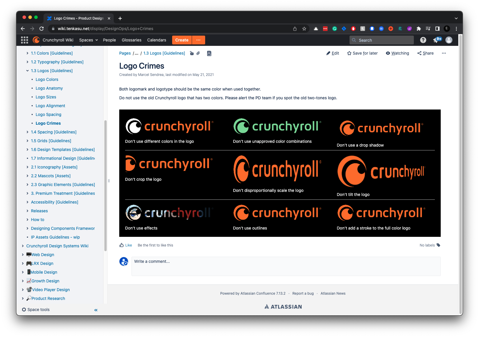
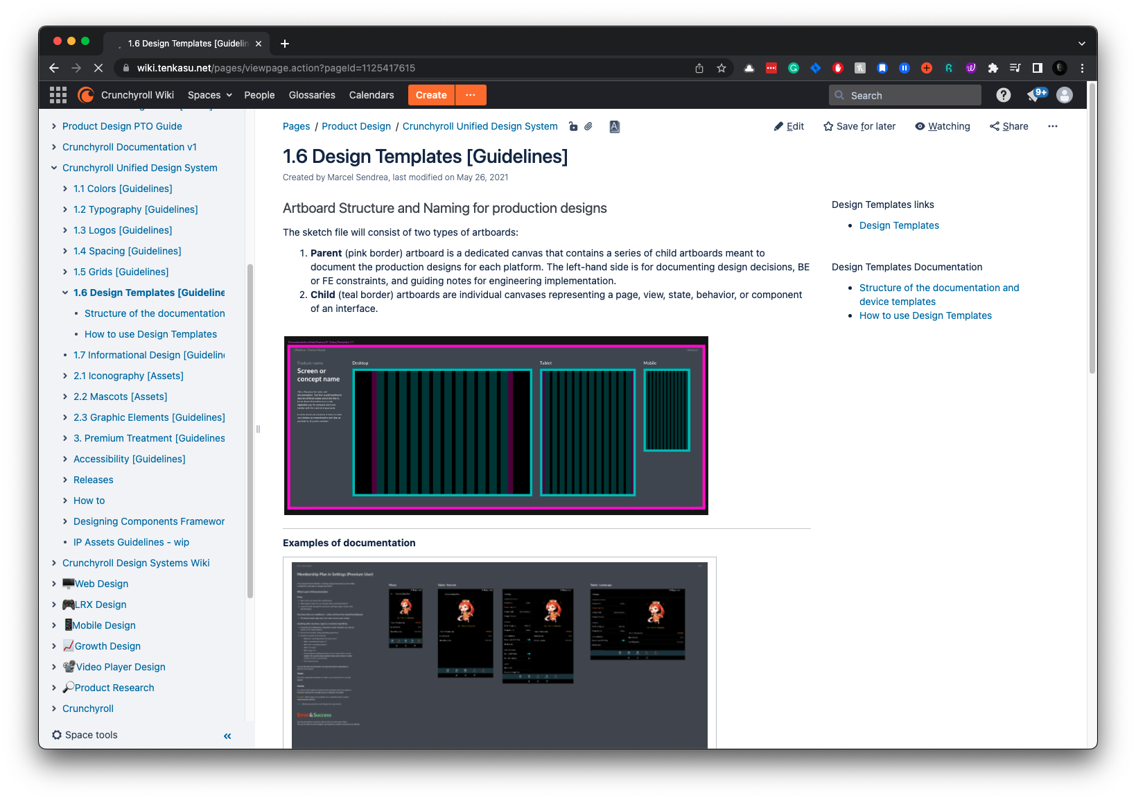
Logos
We want to use our logo correctly to keep our brand identity strong and consistent across all platforms. Our guidelines provide instructions on logo sizes, alignment, spacing, and common mistakes to watch out for.
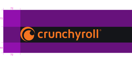
Logo Documentation
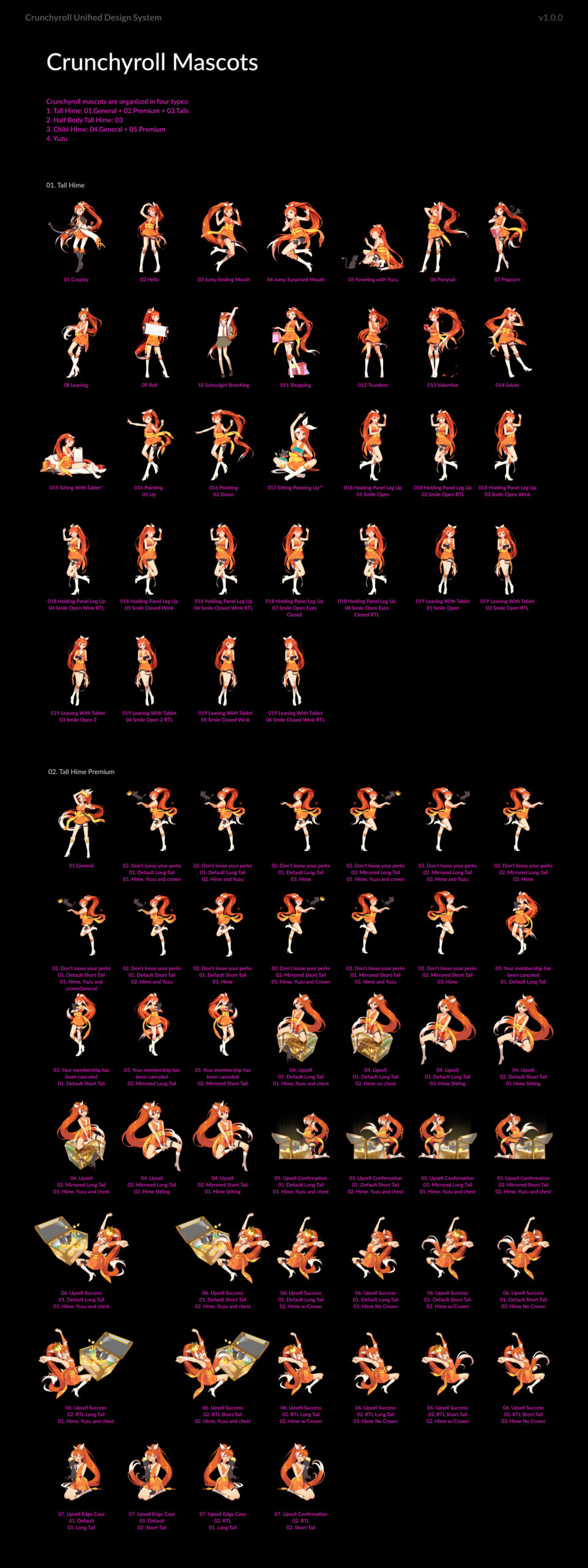
Mascots &
Graphic Elements
Mascots and graphic elements are integral to Crunchyroll’s brand identity, adding personality and vibrancy to the user experience. These elements need to be used consistently to maintain brand integrity.
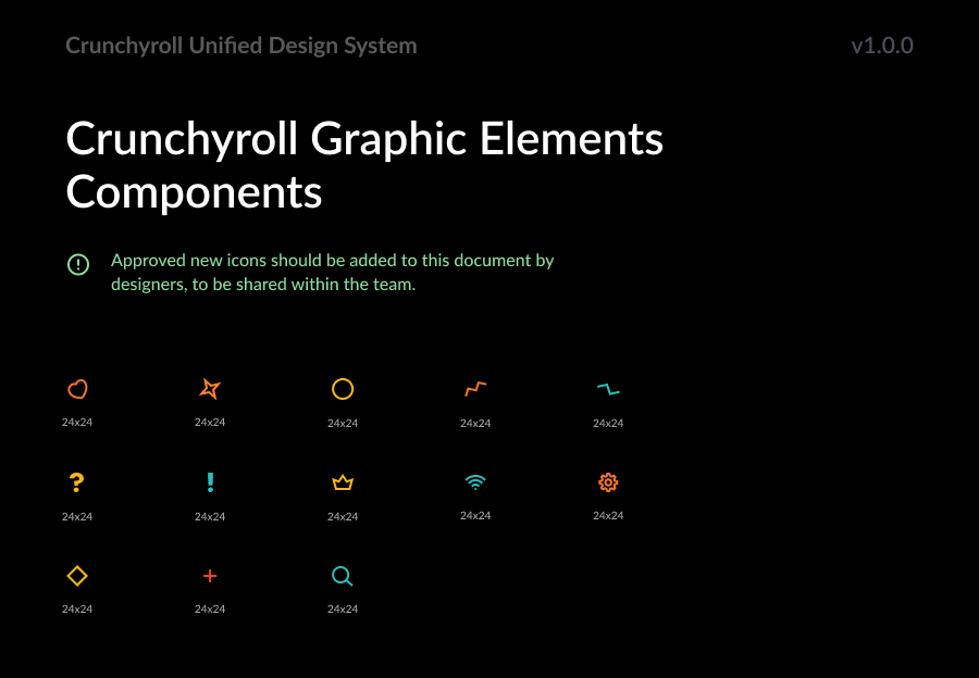
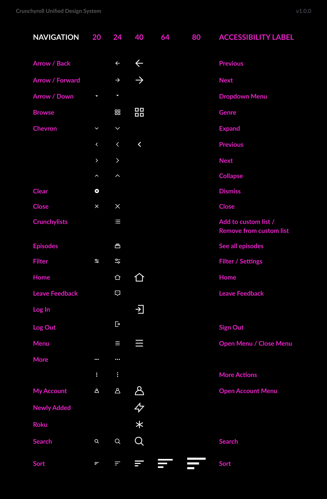
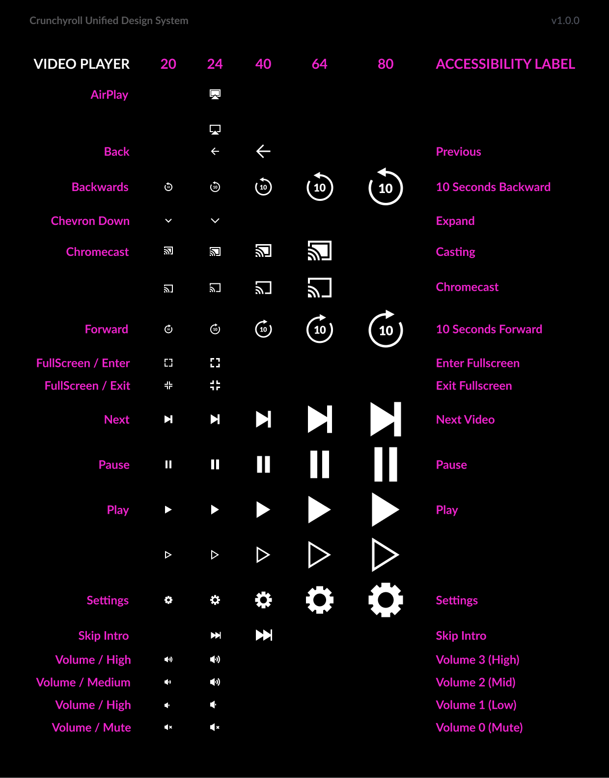
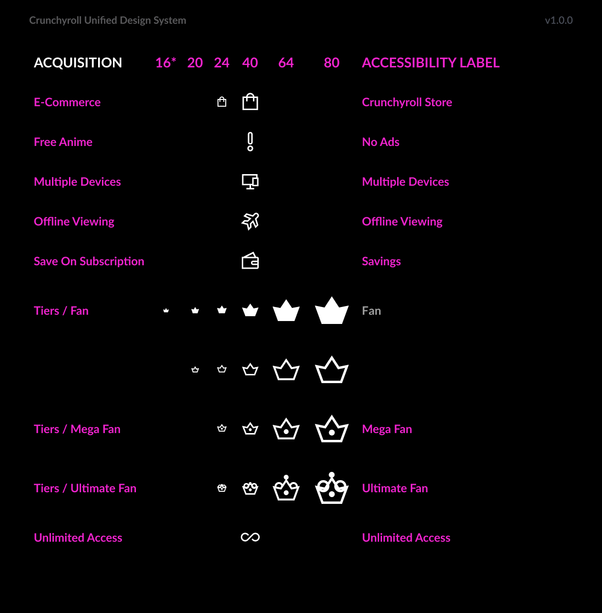
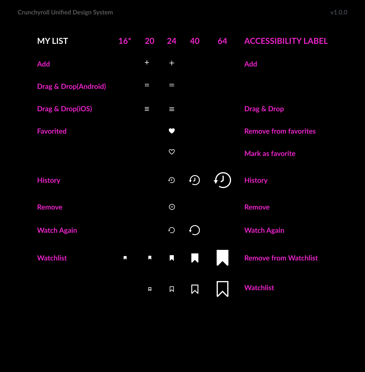
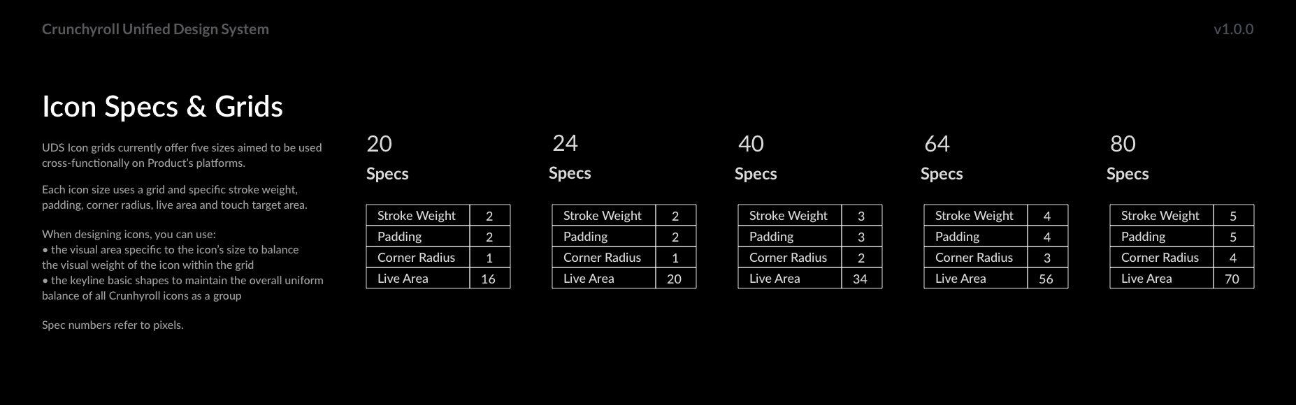
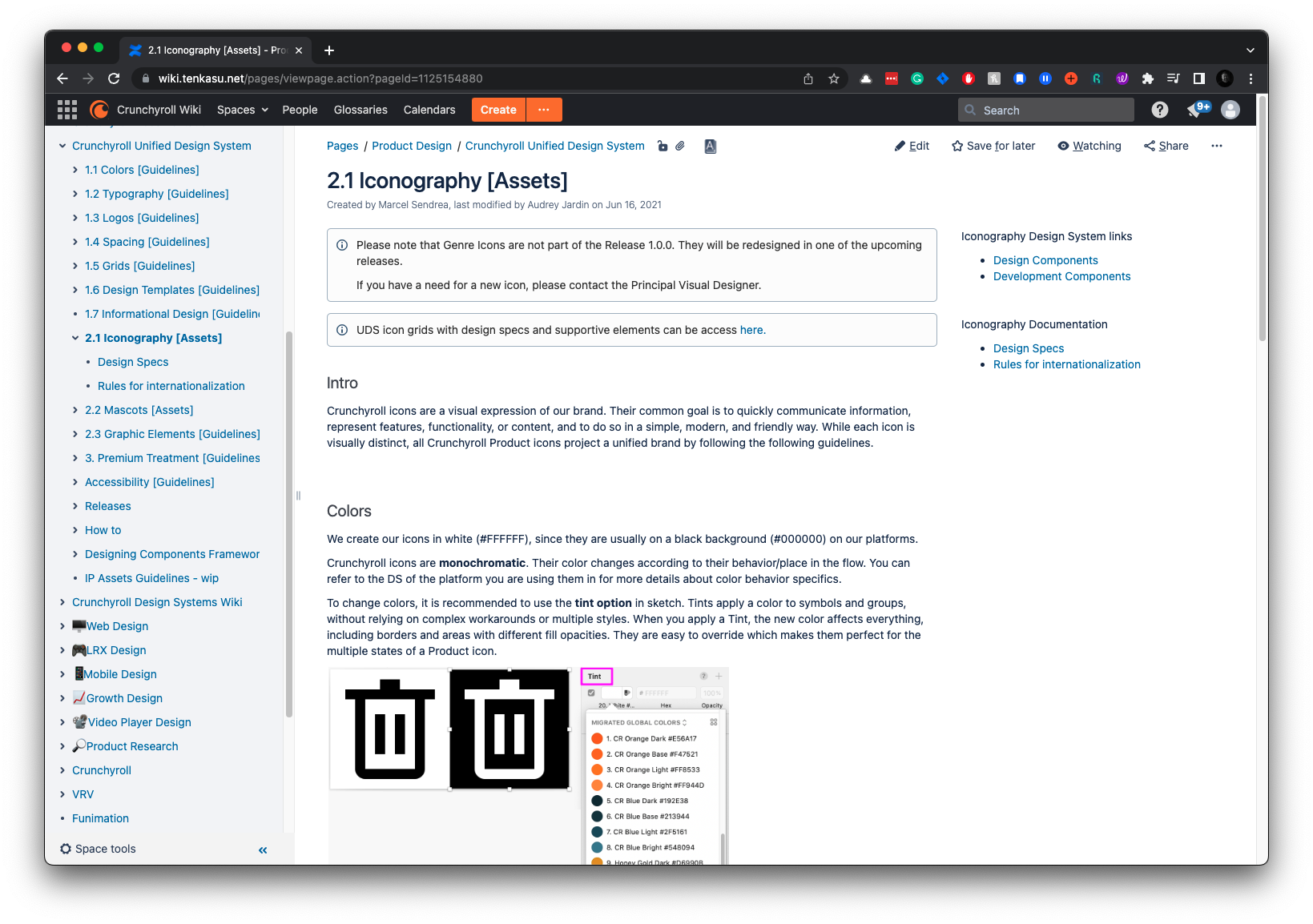
Iconography
Using elegant and recognizable symbols, we enhance the user experience by providing clear visual cues. Our icons are designed to be easily understood and consistent across all platforms.
Crunchyroll celebrates anime and manga culture with a handcrafted icon library tailored to different functions. Detailed guidelines ensure clarity and readability, and the library is accessible to multiple departments to encourage collaboration.
UDS Iconography
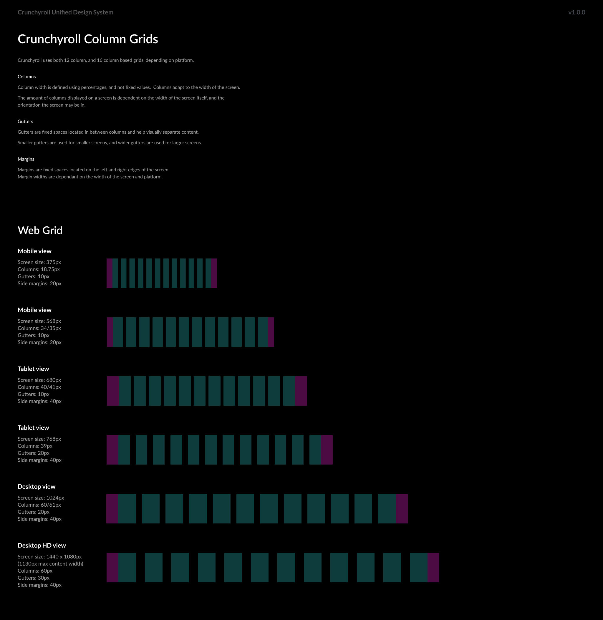
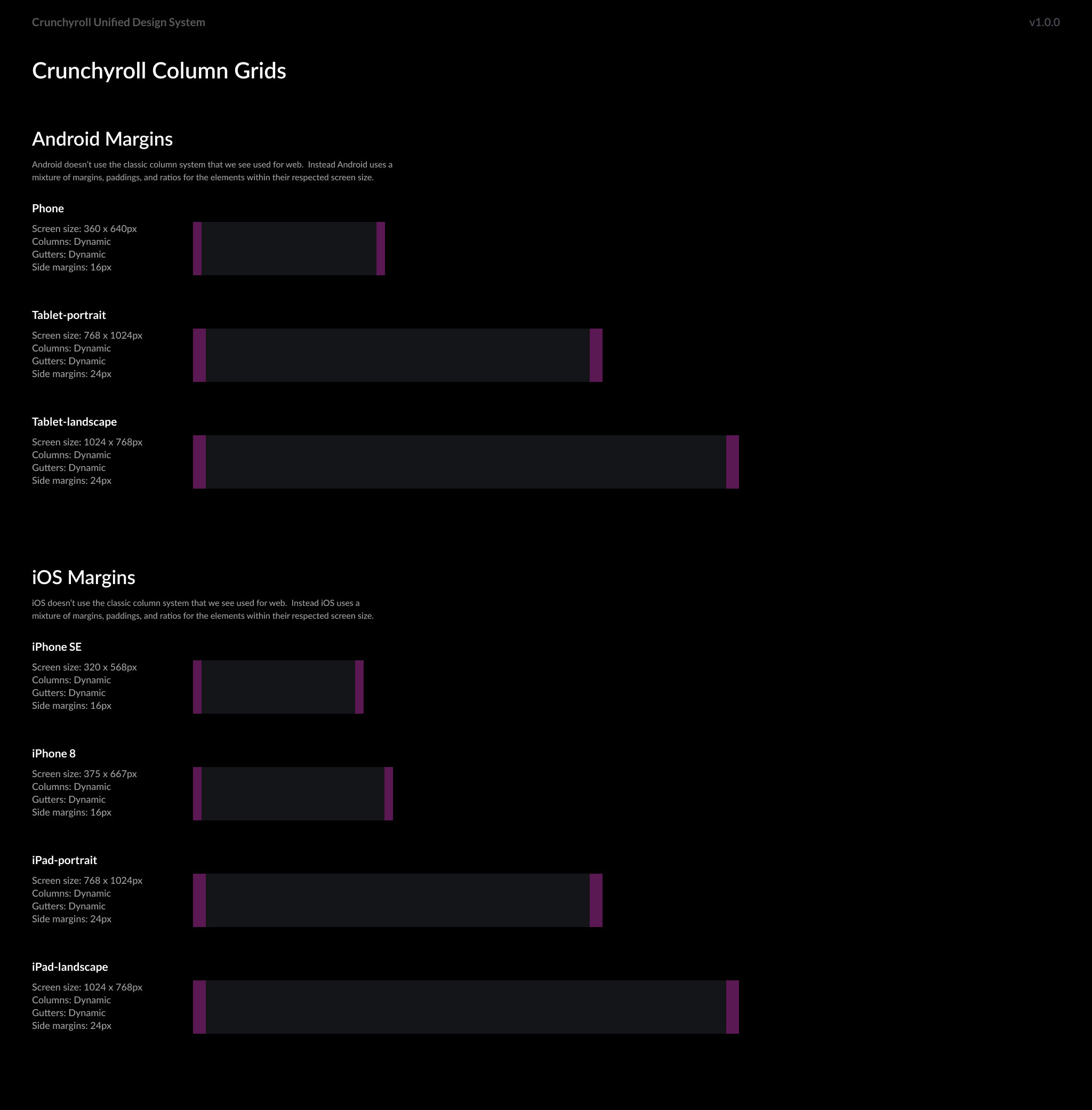
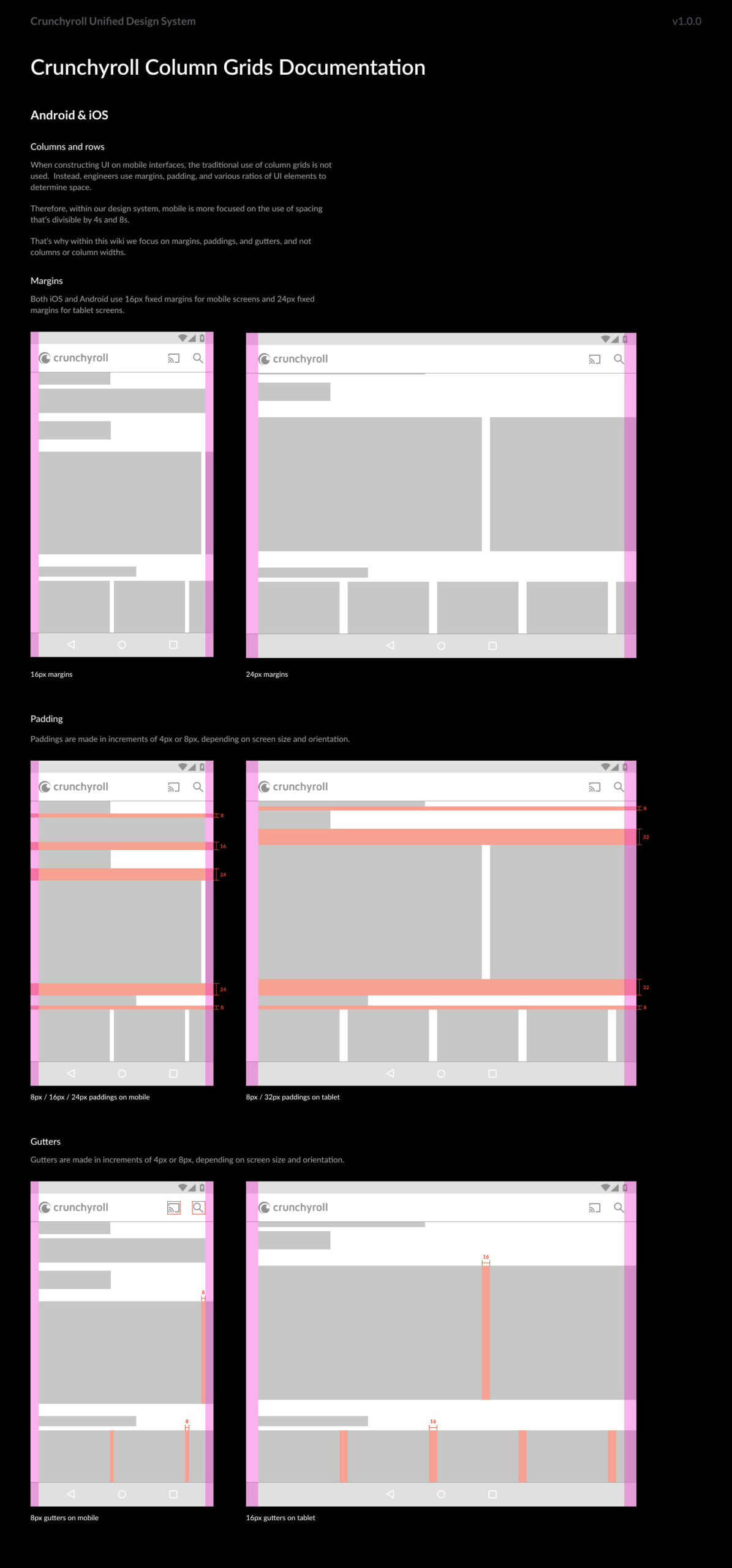
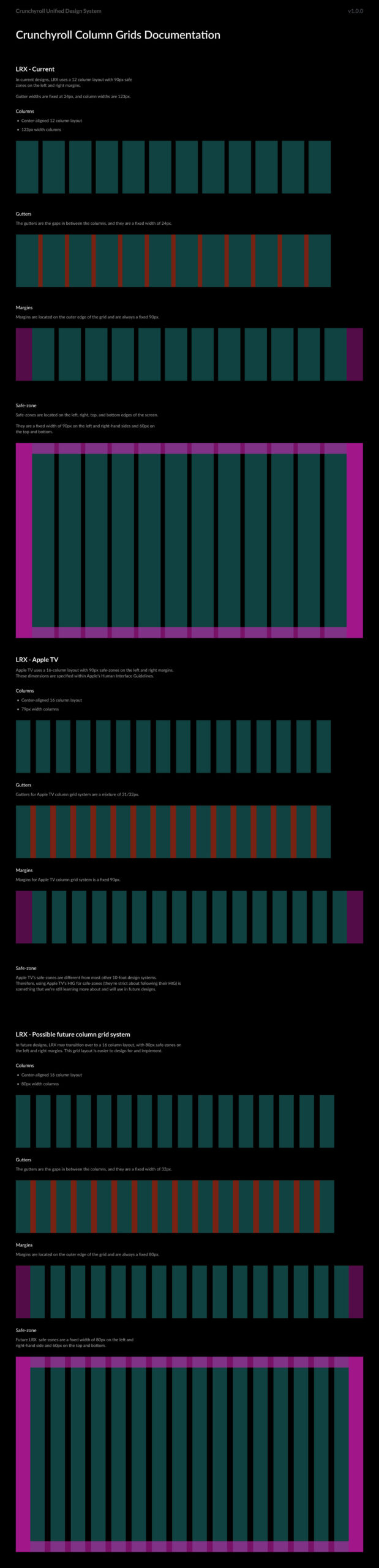
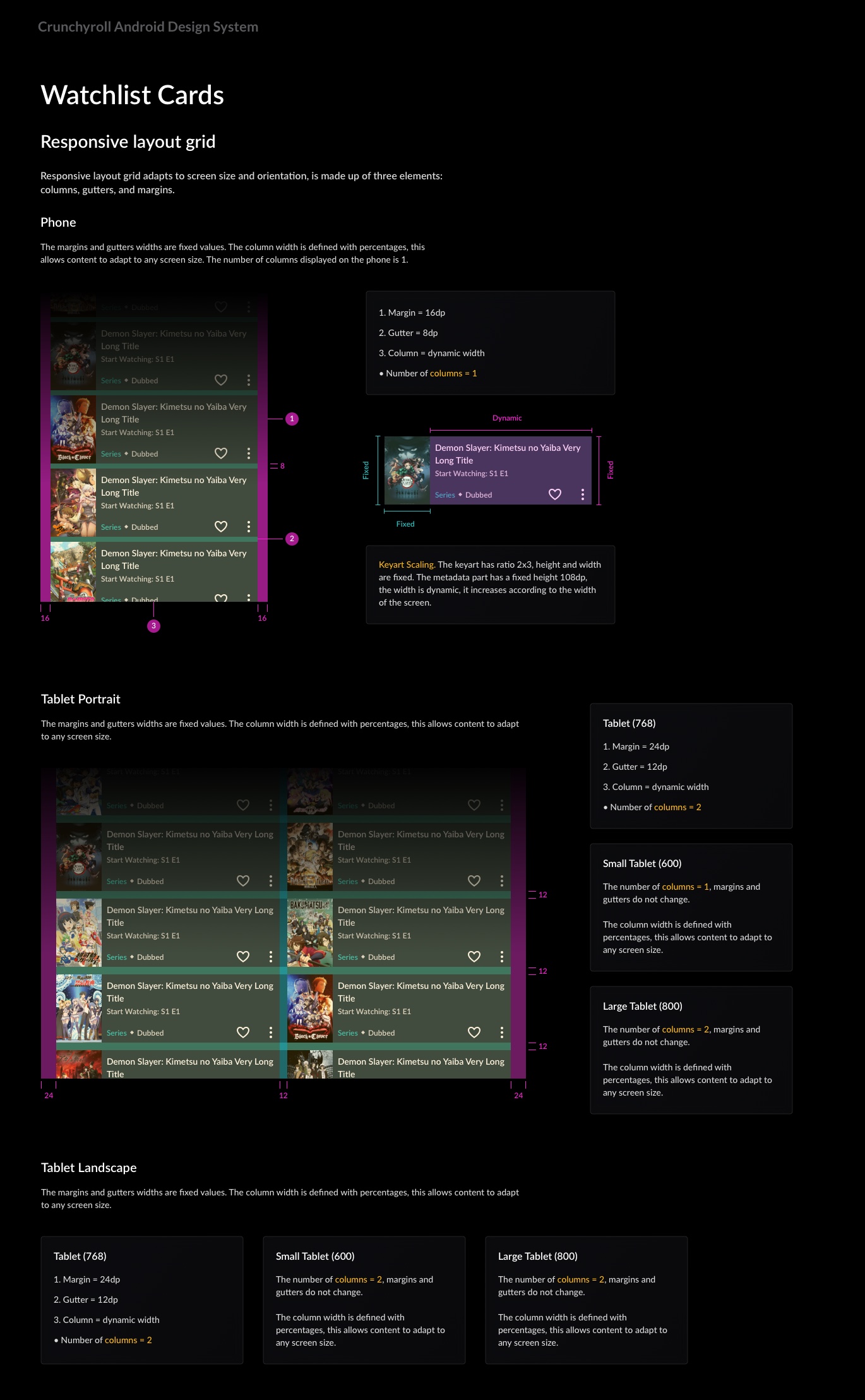
Column Grids
& Spacing
With consistent spacing and column grids, we aim to create balanced, visually appealing designs. Our guidelines ensure uniformity across all platforms, enhancing readability and user experience.
We created a flexible spacing system and column grid to ensure harmony among all UI elements.
Preparing a design for development promotes systematic thinking and accelerates layout organization. We also conducted comprehensive testing of grids and spacing components on various devices and screen sizes.
UDS Column
Grids and Spacing
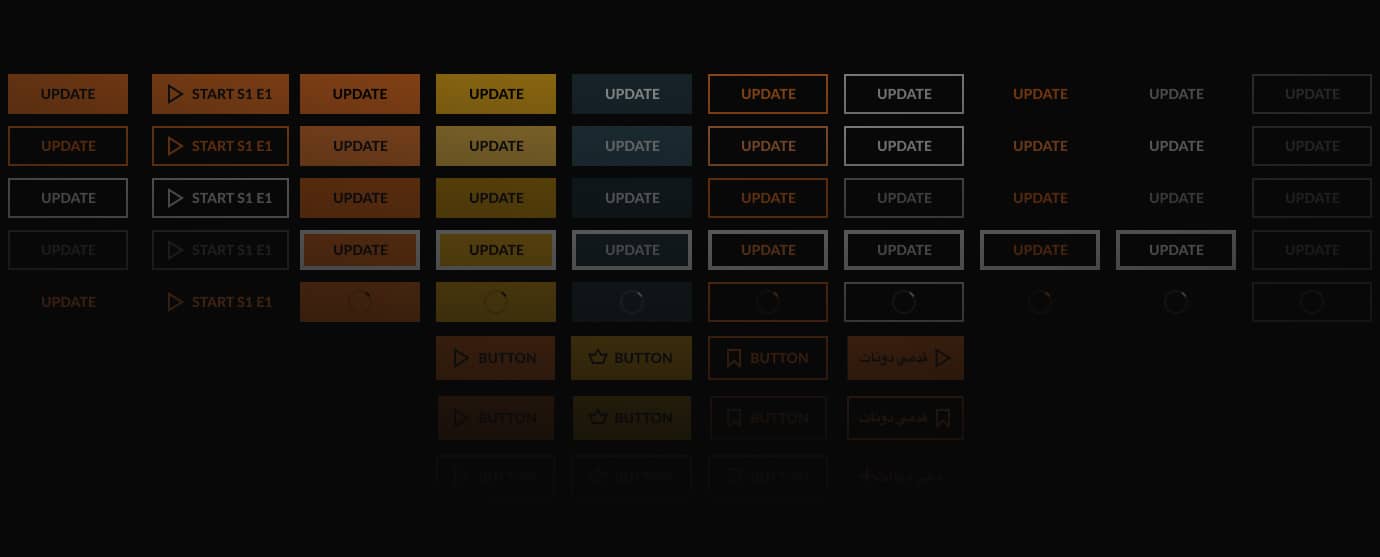
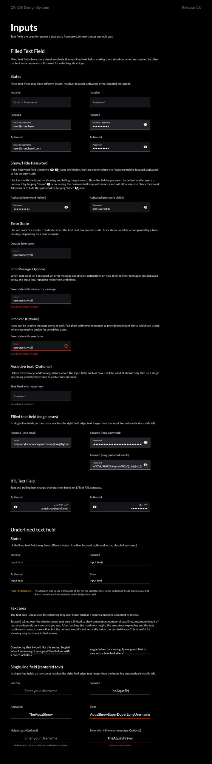
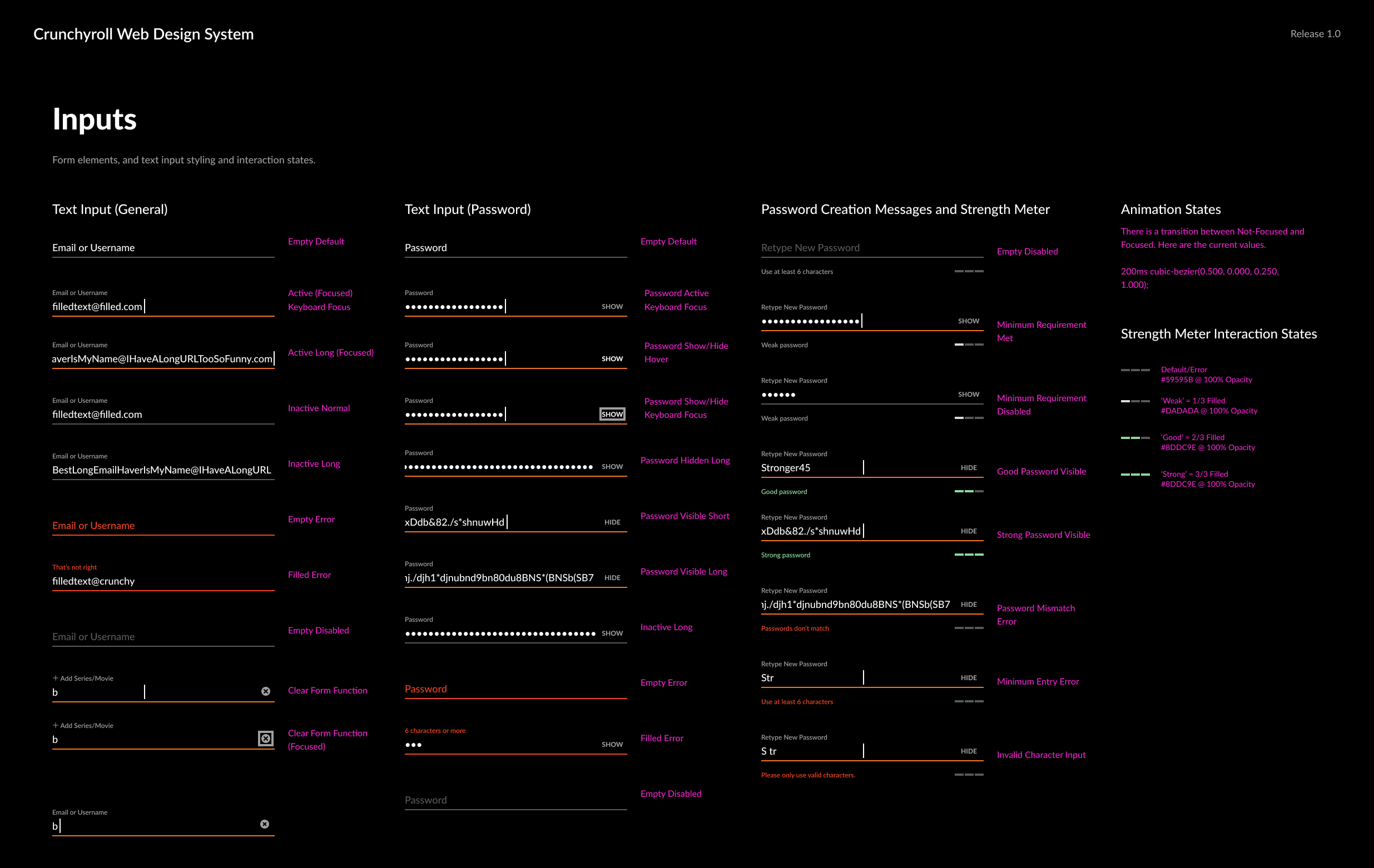
Forms
The iOS and Android forms changed during the redesign of several features across different HIG and Google Material releases. Over time, the level of discrepancy and inconsistency became unbearable.
I had to break it down into smaller pieces, clean it up, and rethink an adaptable approach.
Our input components, which include various types such as text fields, search inputs, and dropdowns, were designed to maintain uniformity in style and functionality across all platforms.
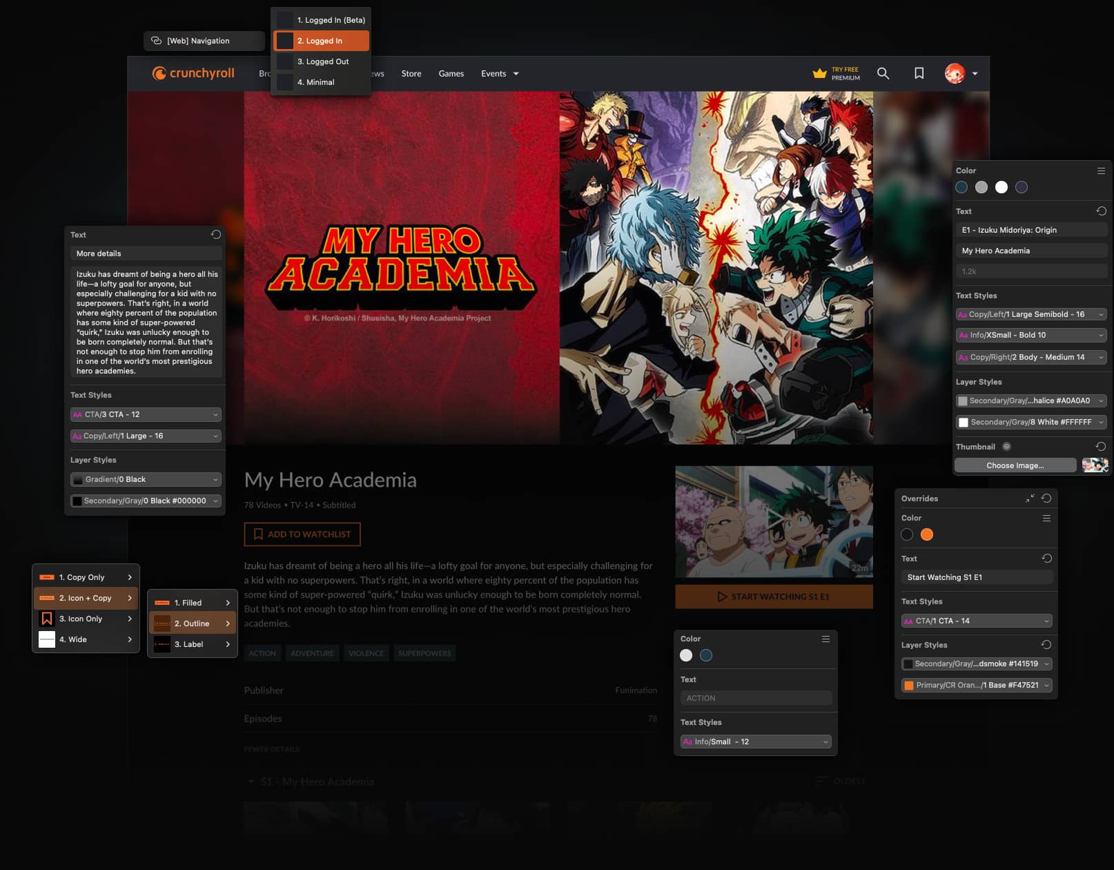
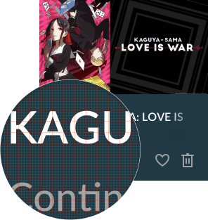
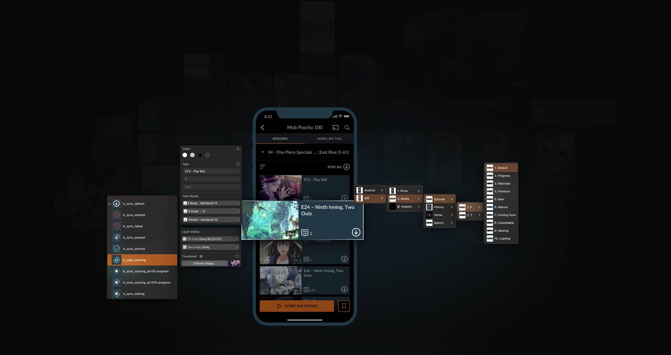
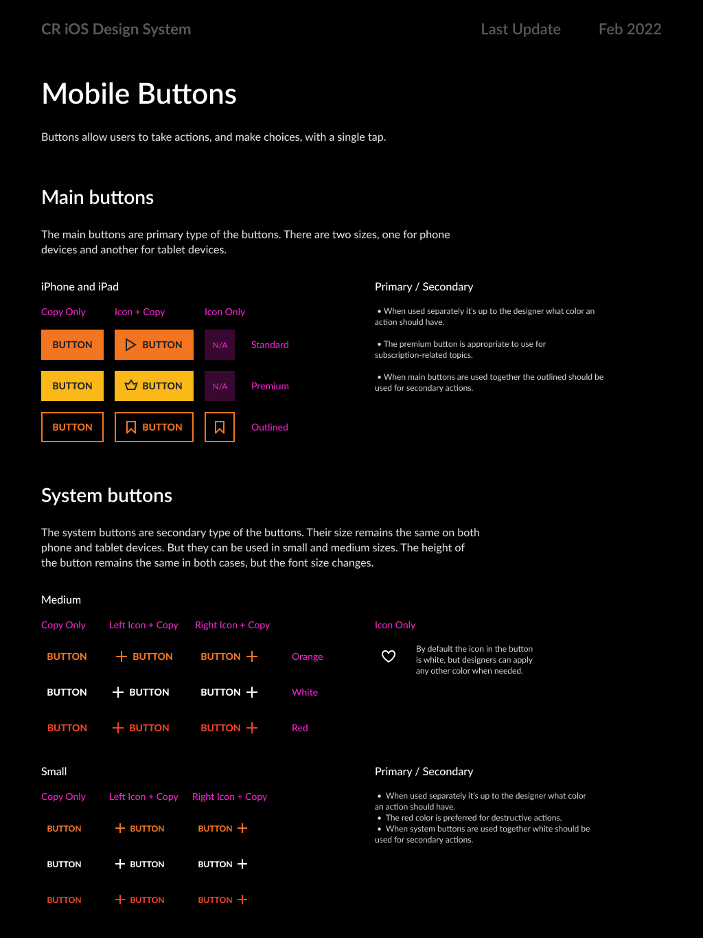
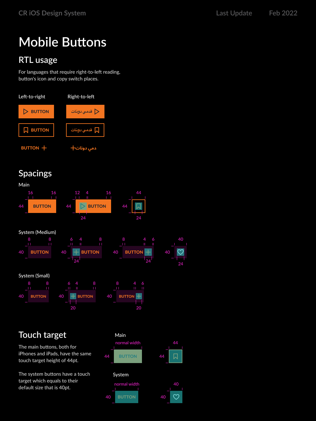
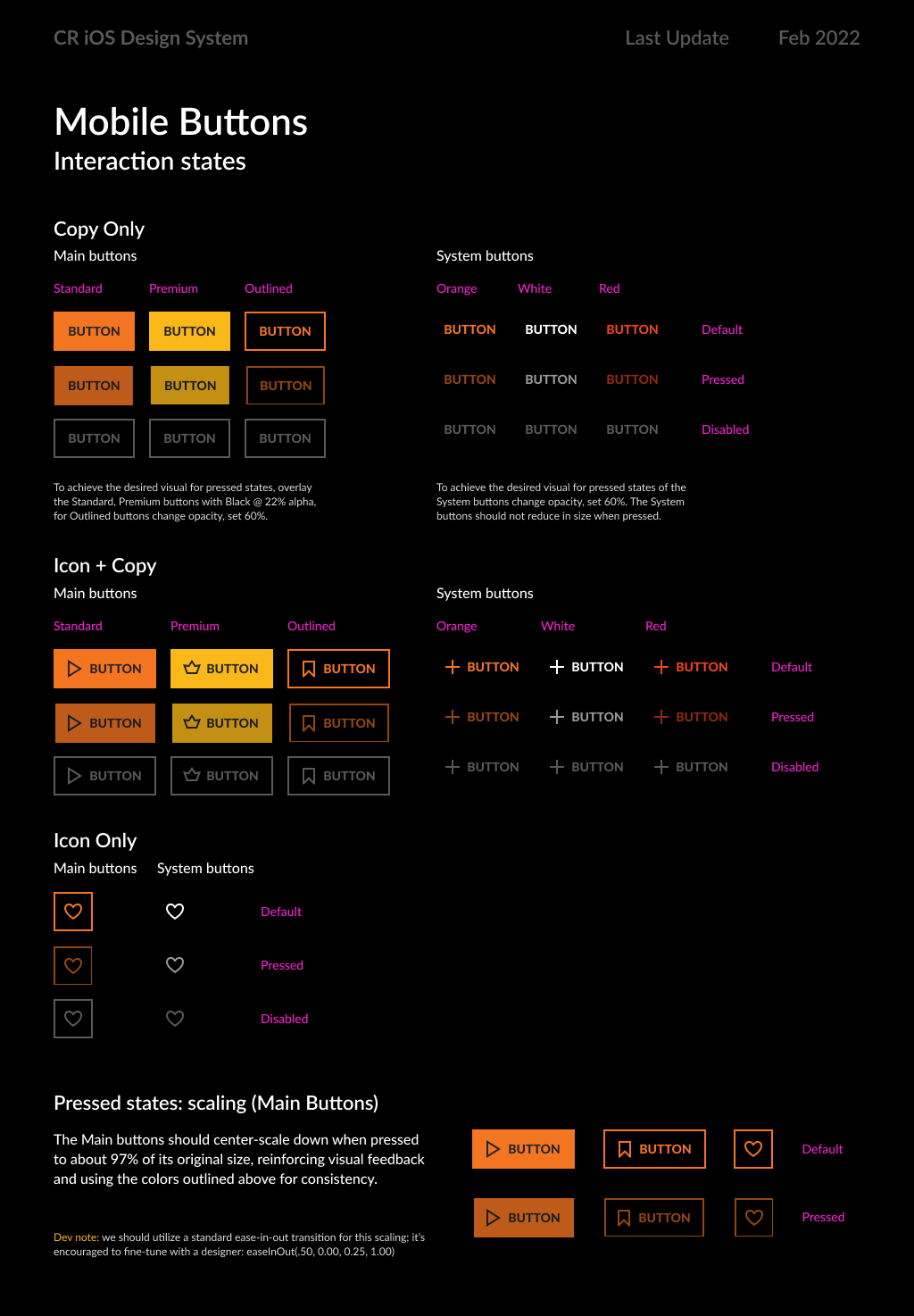
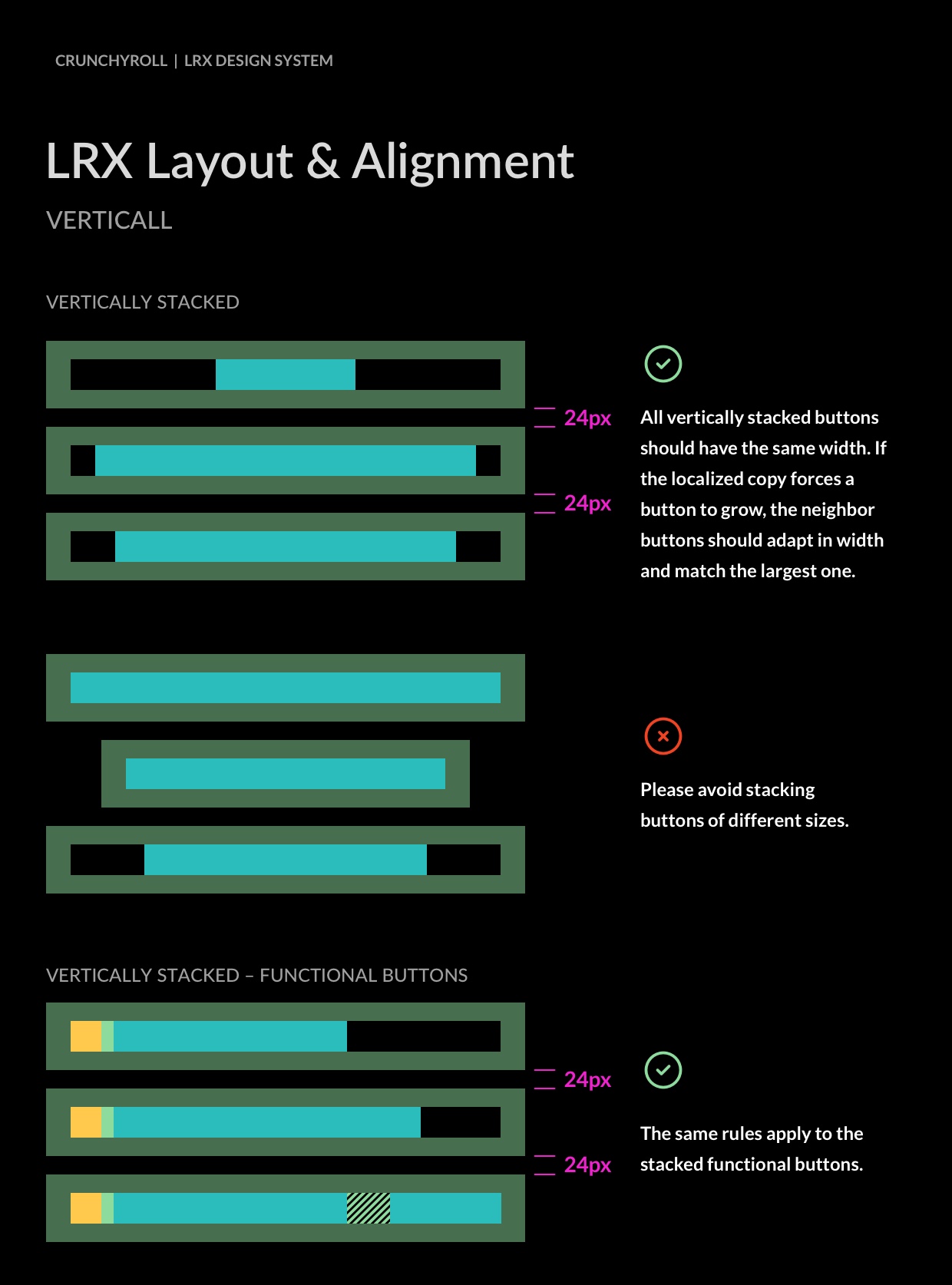
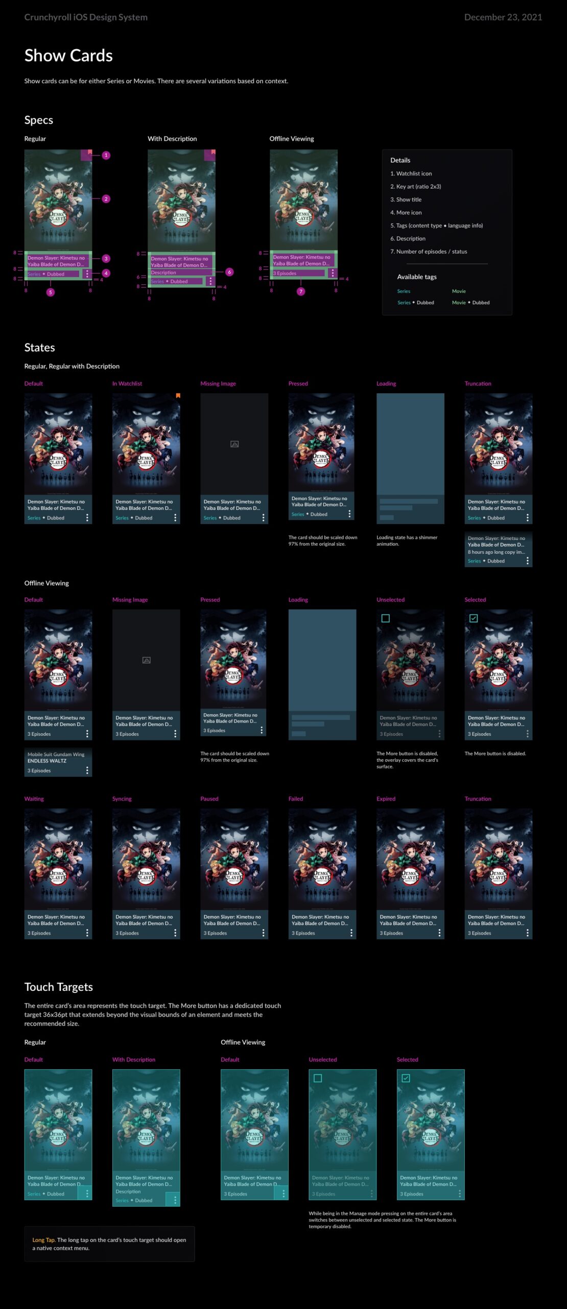
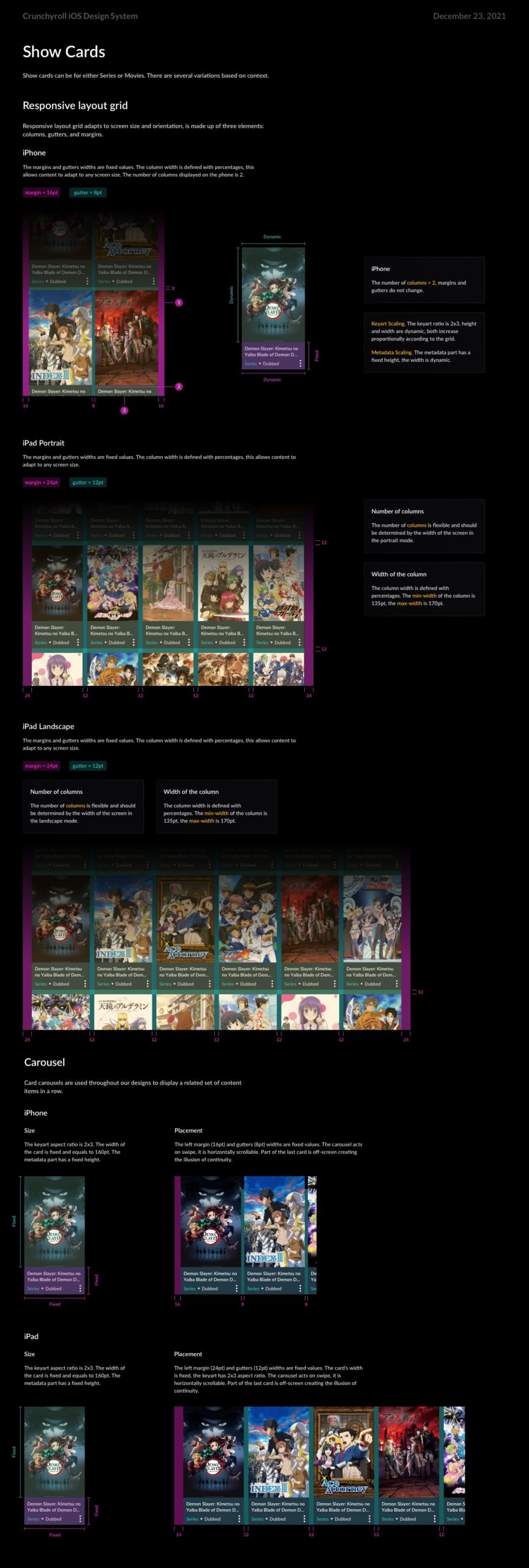
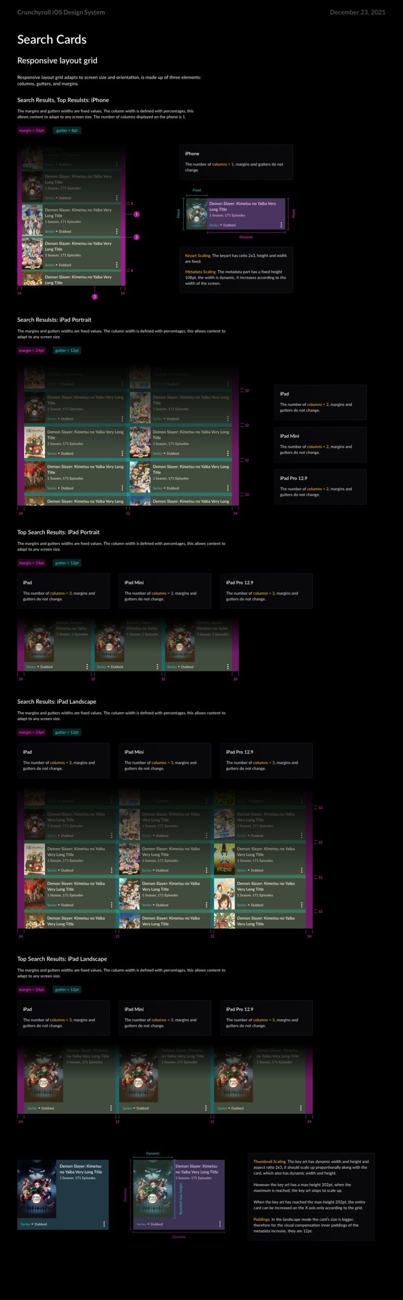
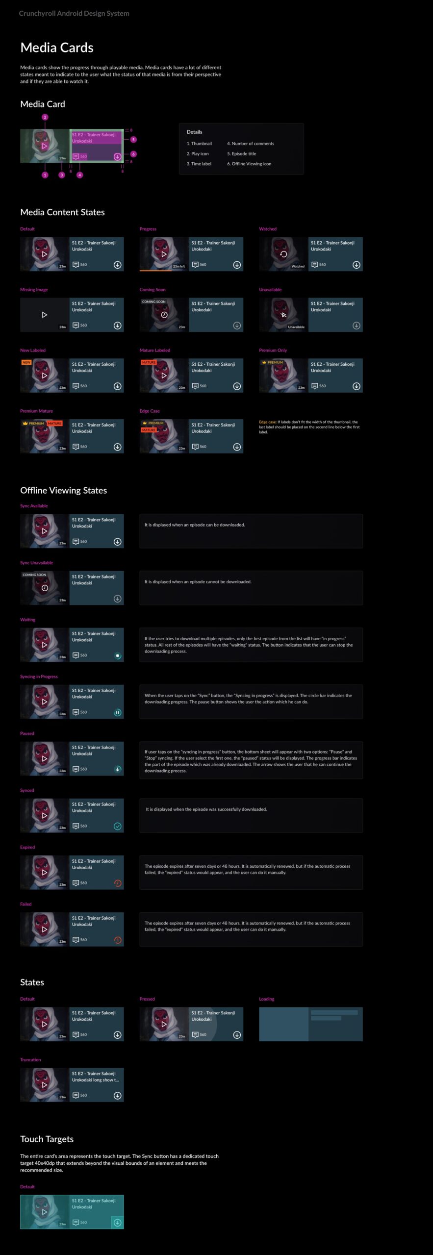
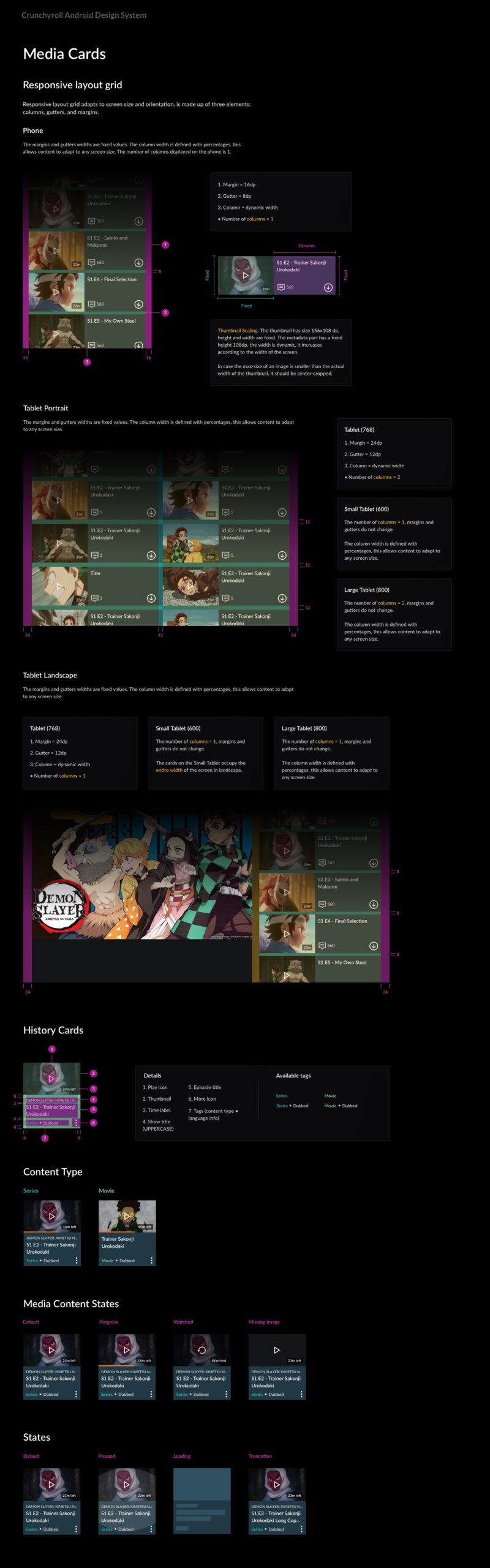
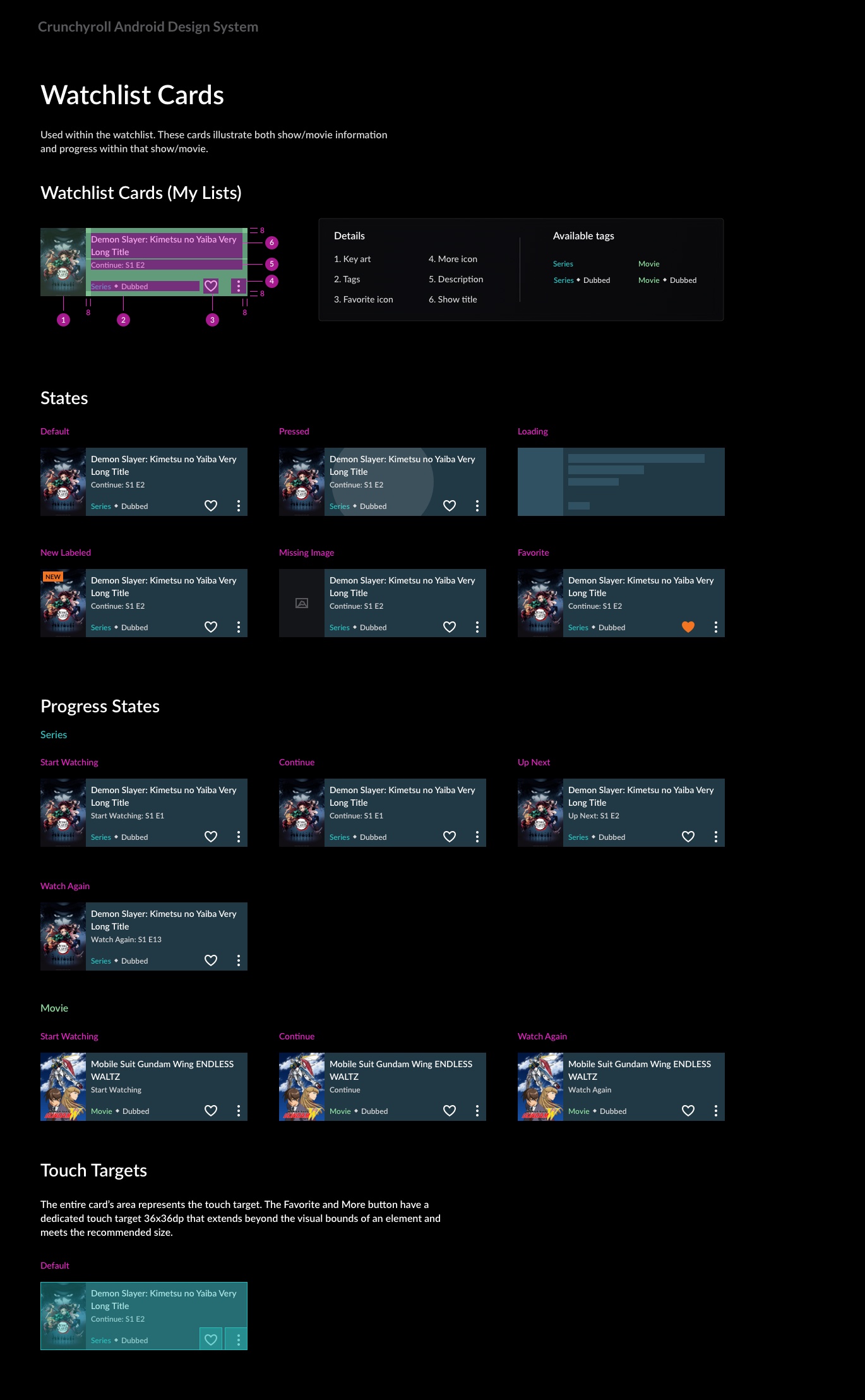
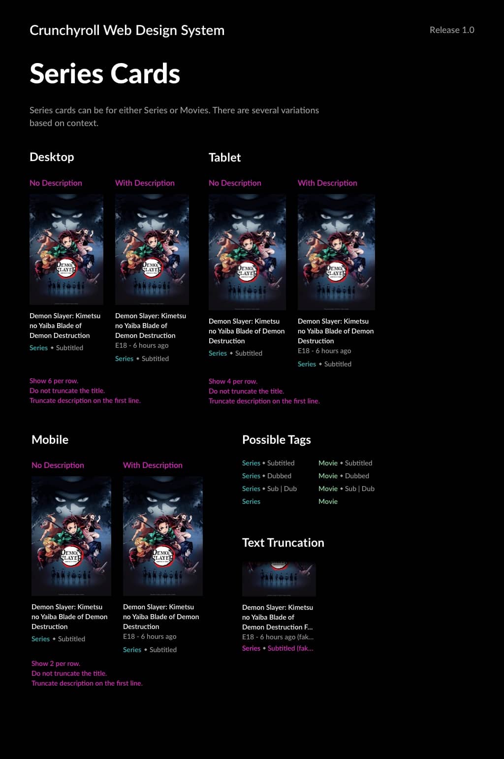
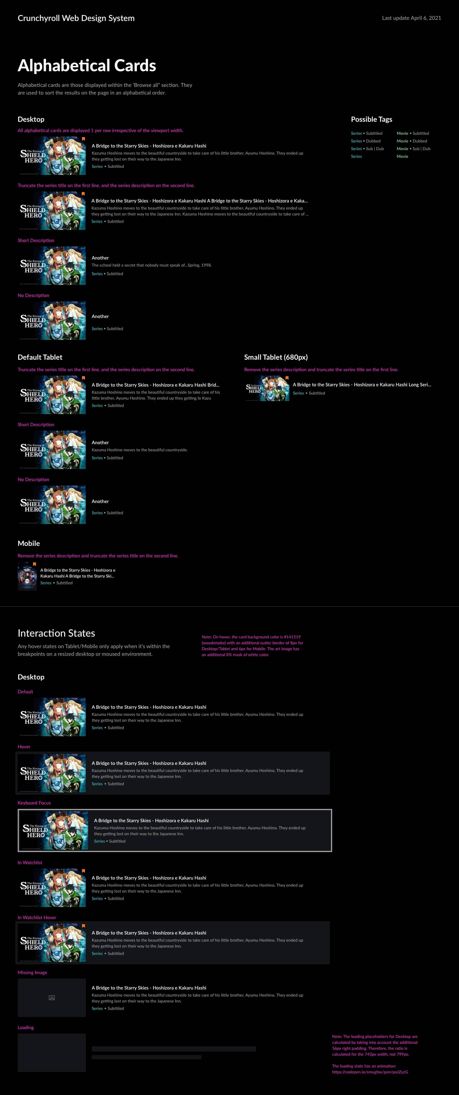
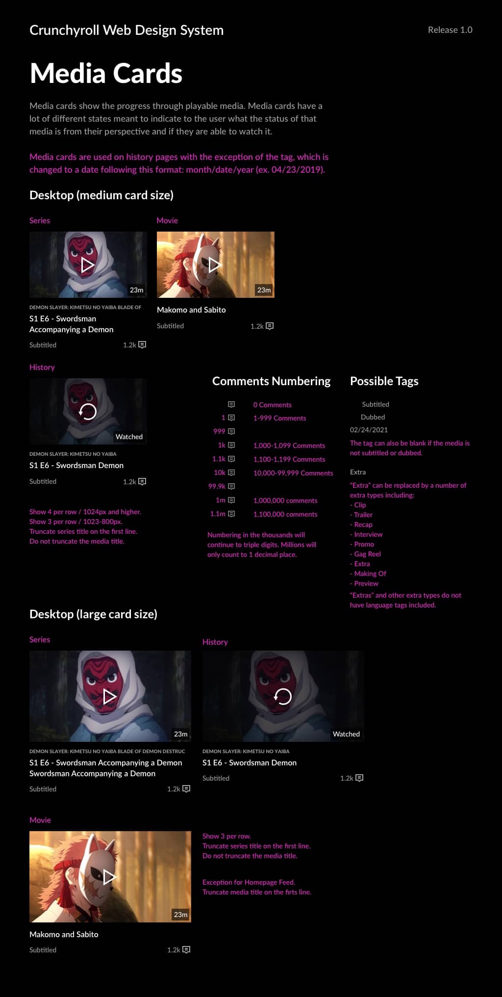
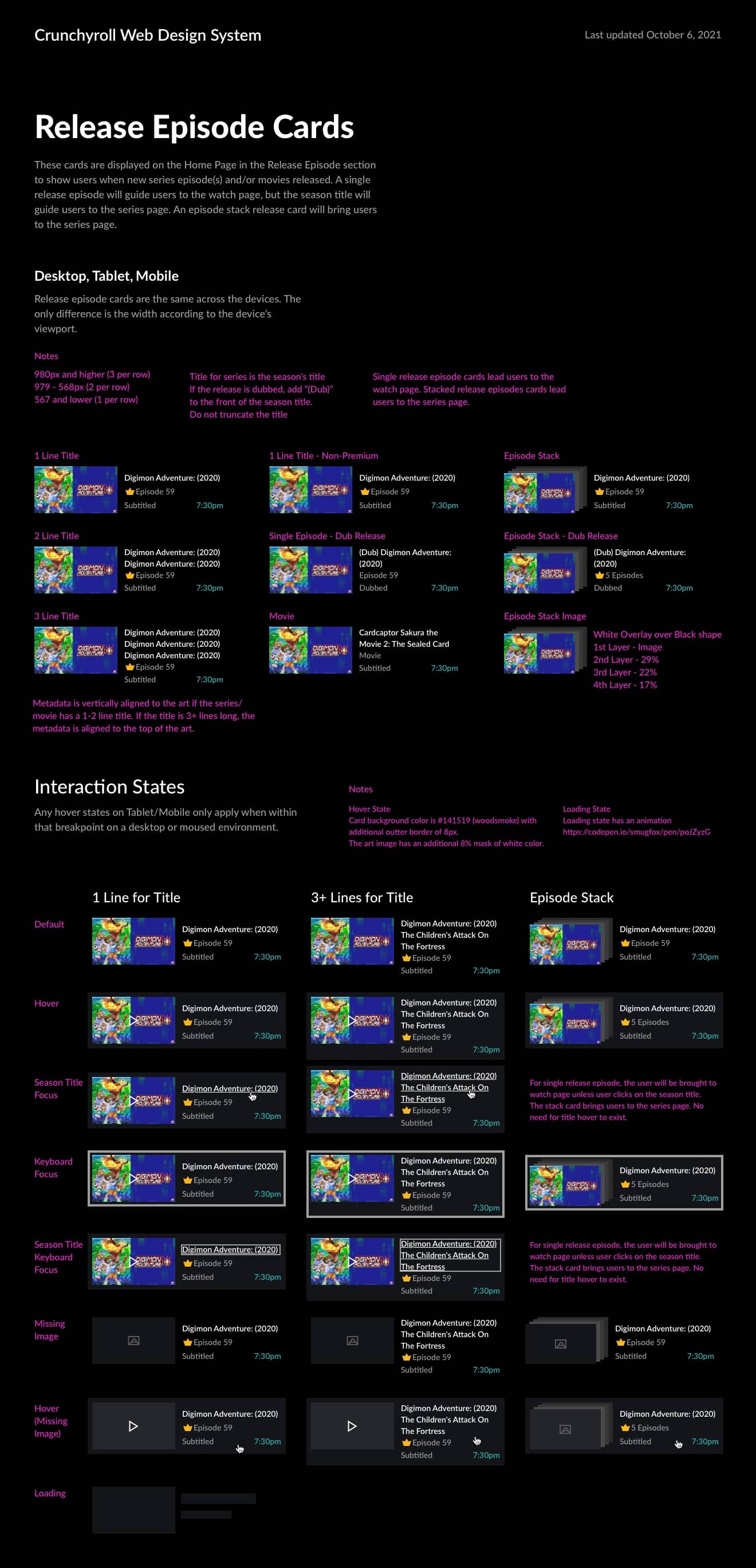
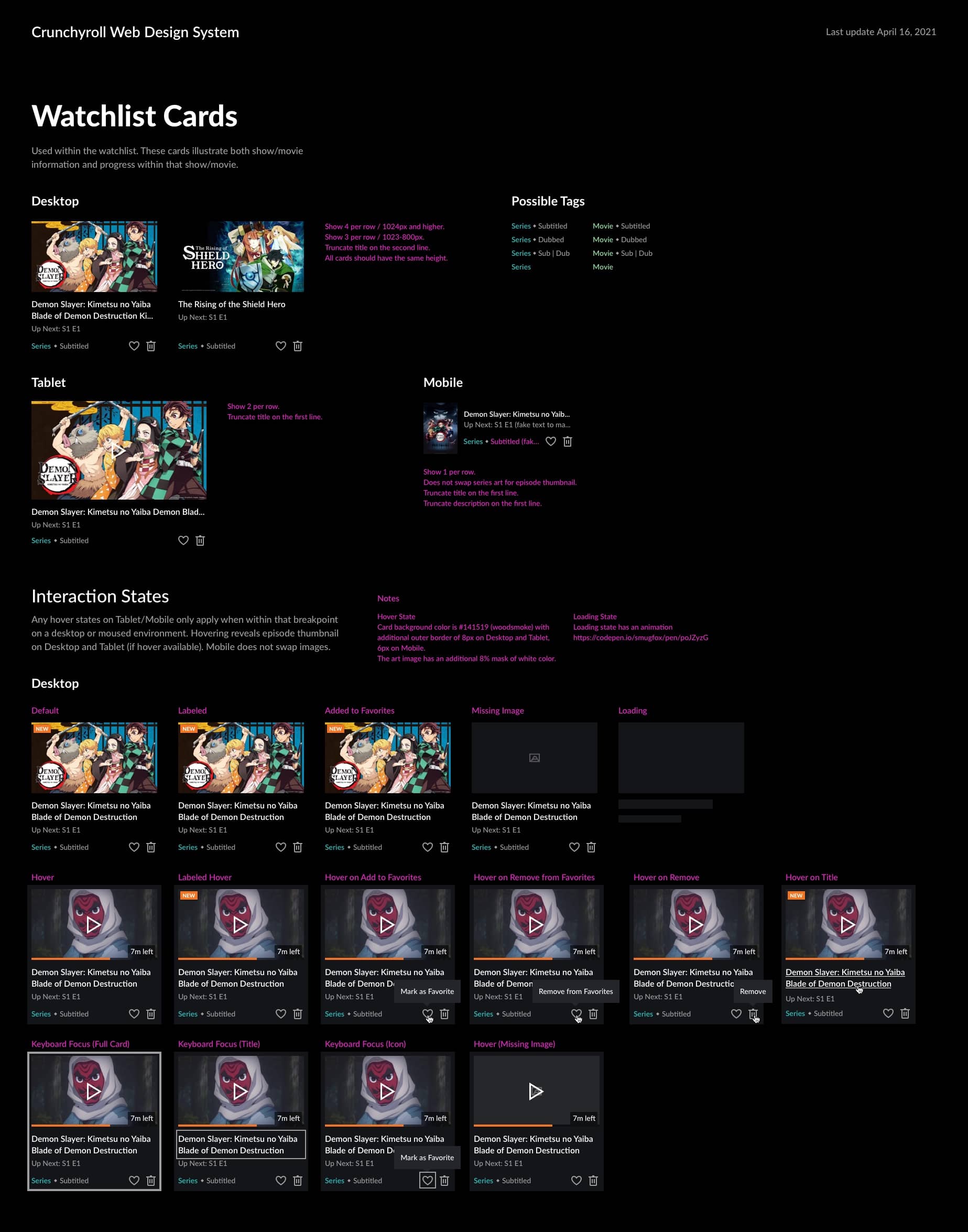
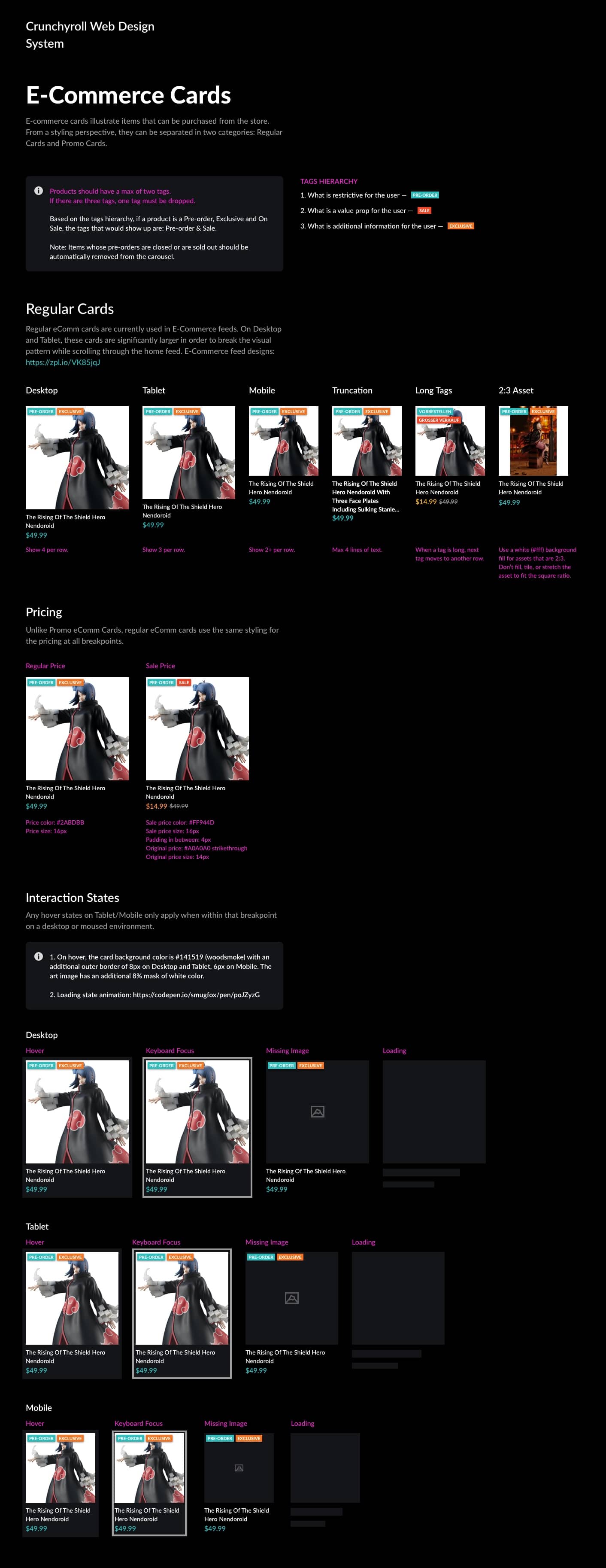
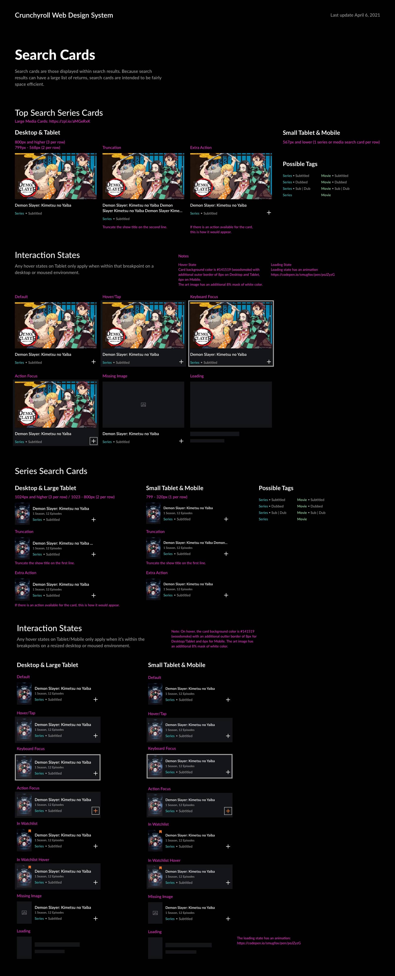
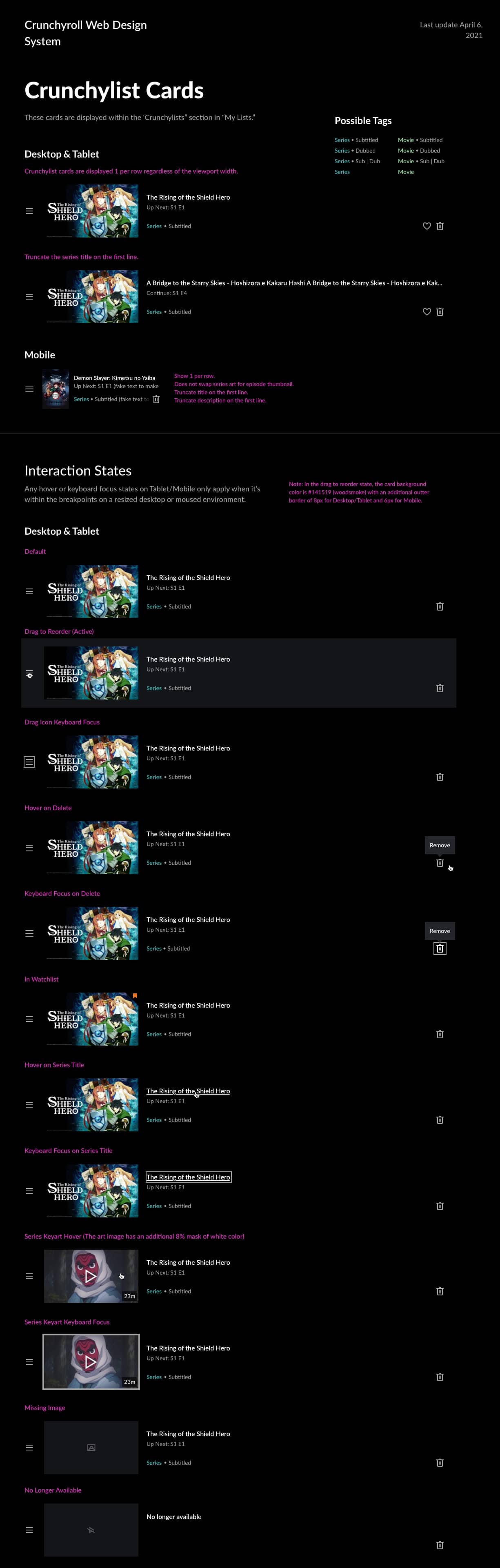
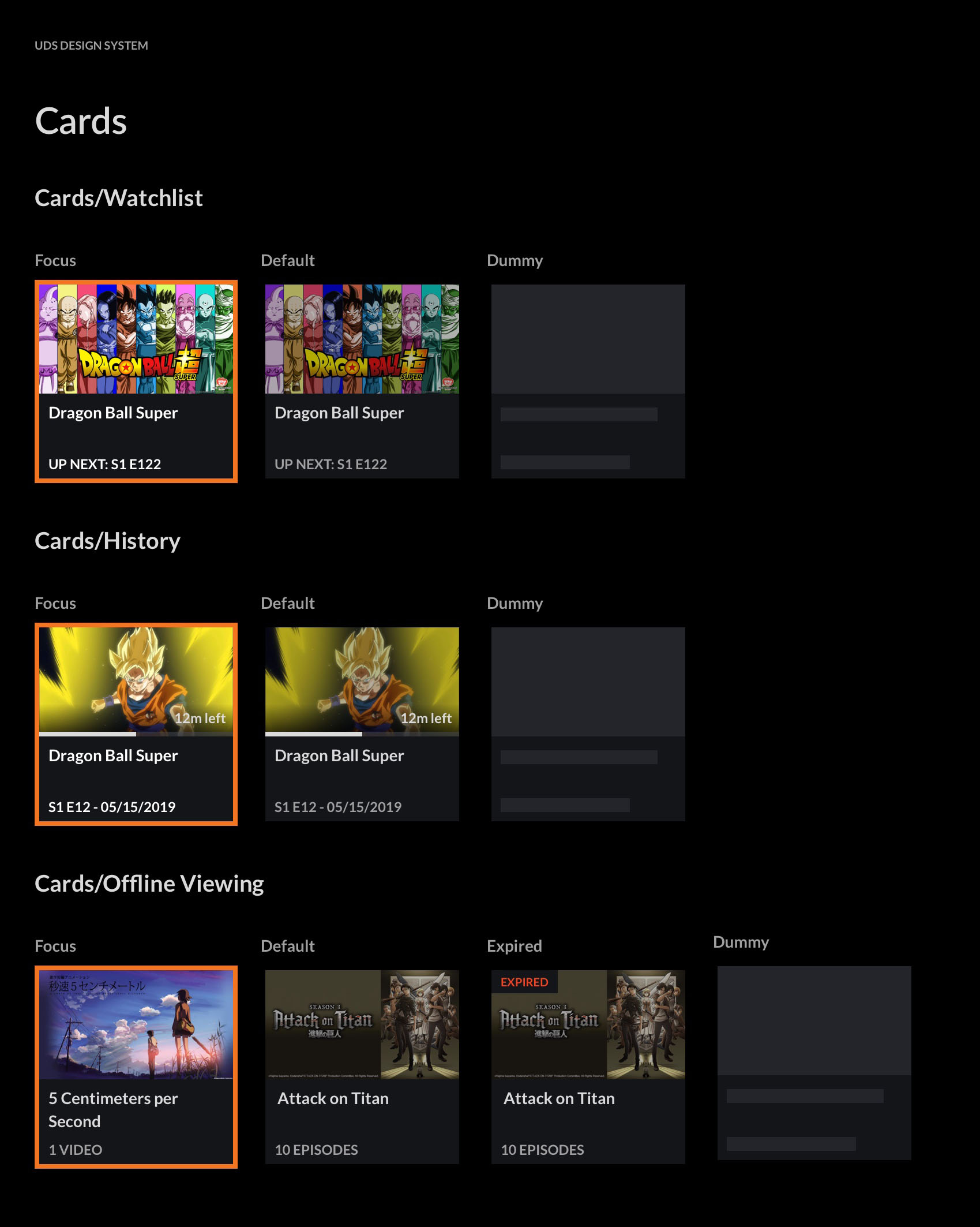
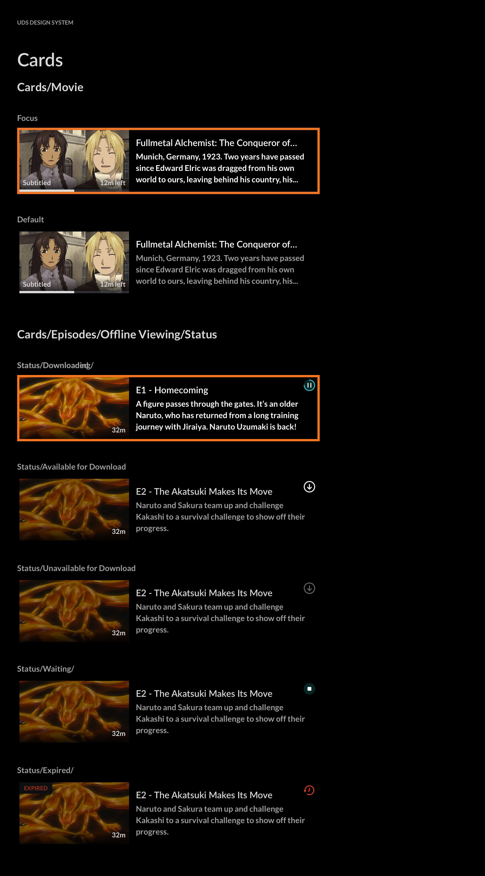
Cards
Cards are the core of our system, designed to display anime series and episodes across platforms. This was one of the most challenging tasks due to the need for consistency, ease of use, and anatomy that will work for designers and developers.
Extensive research and user testing guided our design iterations. Feedback from design and development teams ensured practical, implementable solutions.
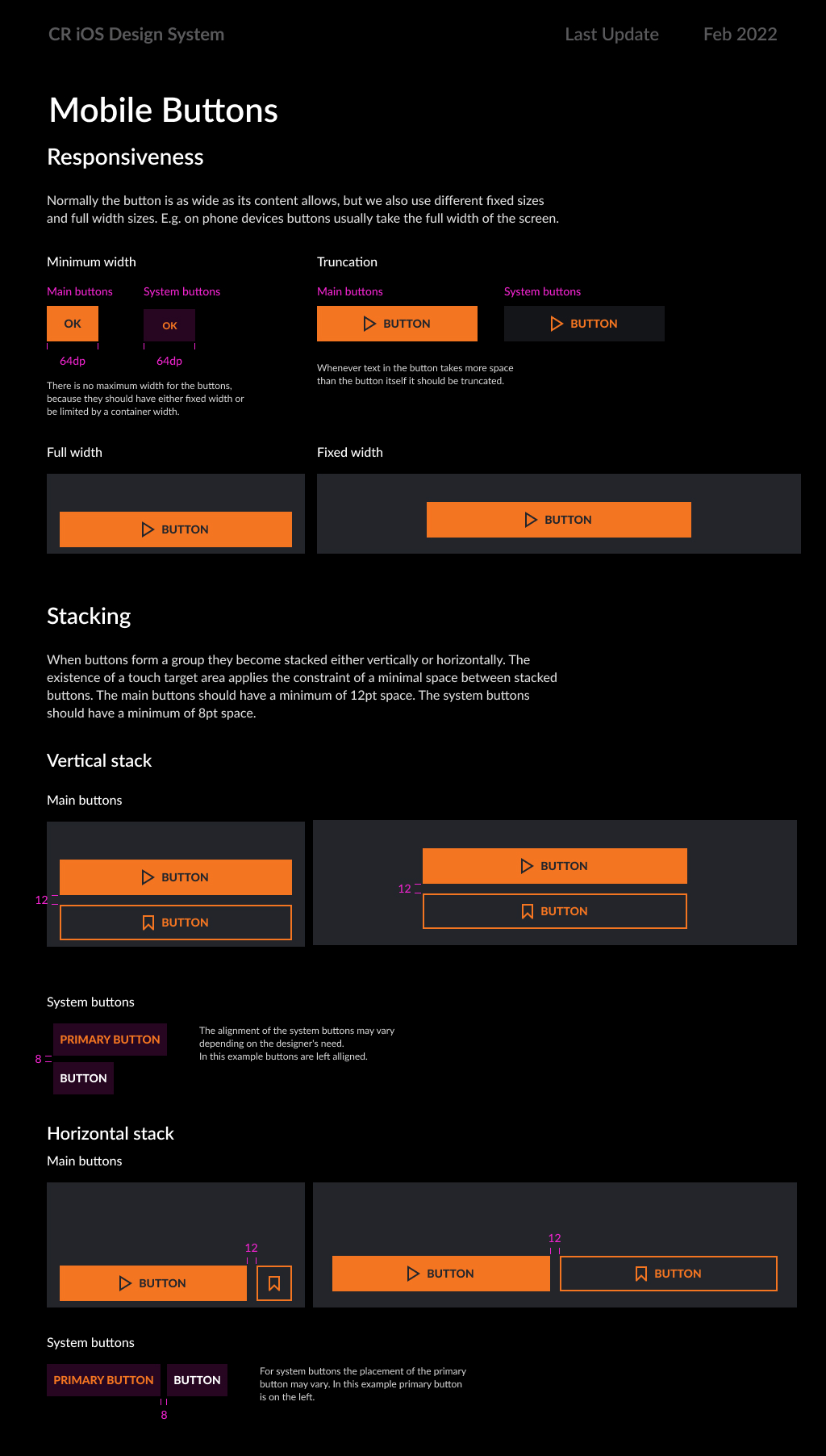
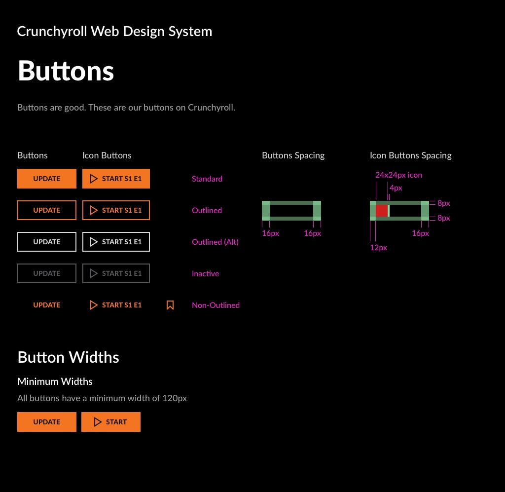
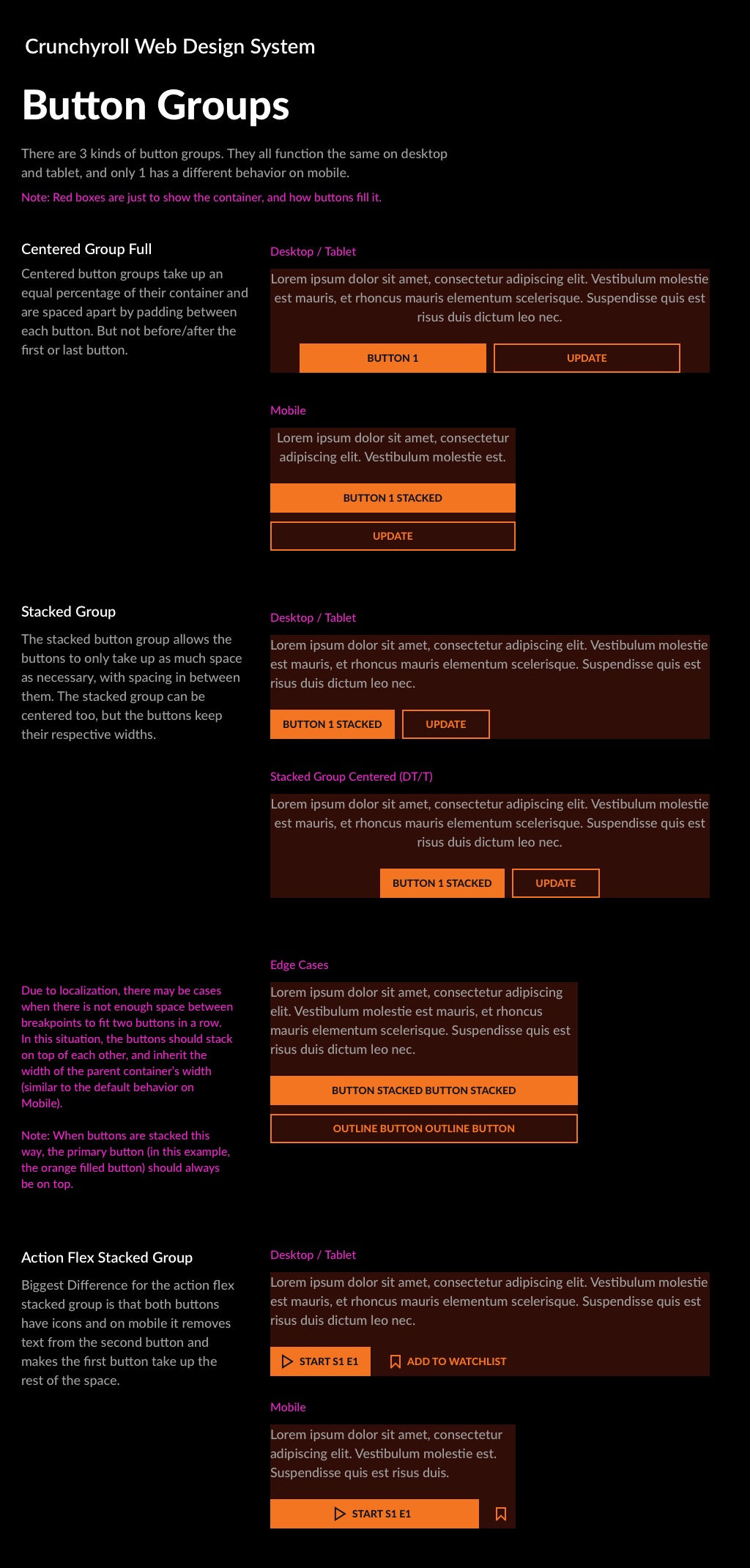
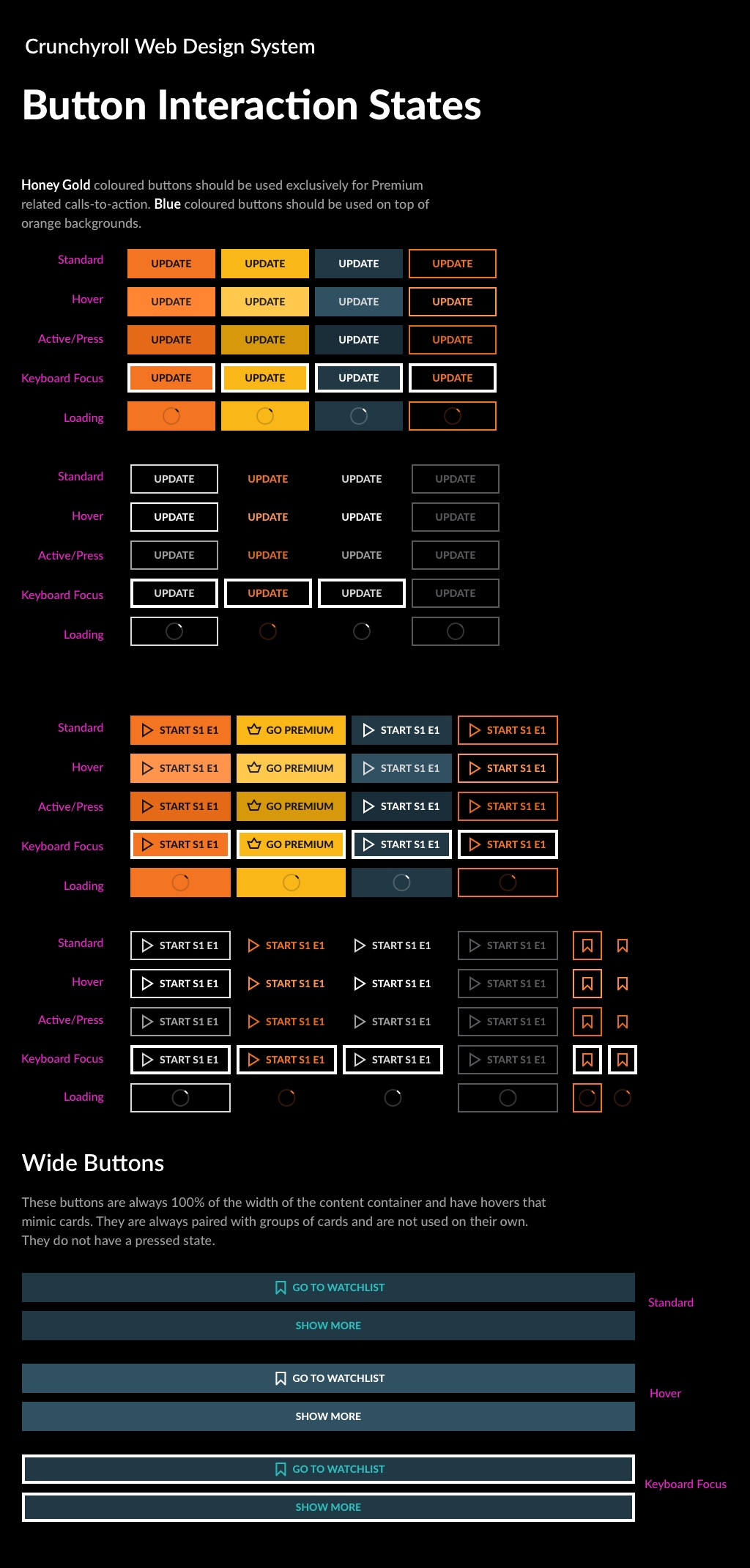
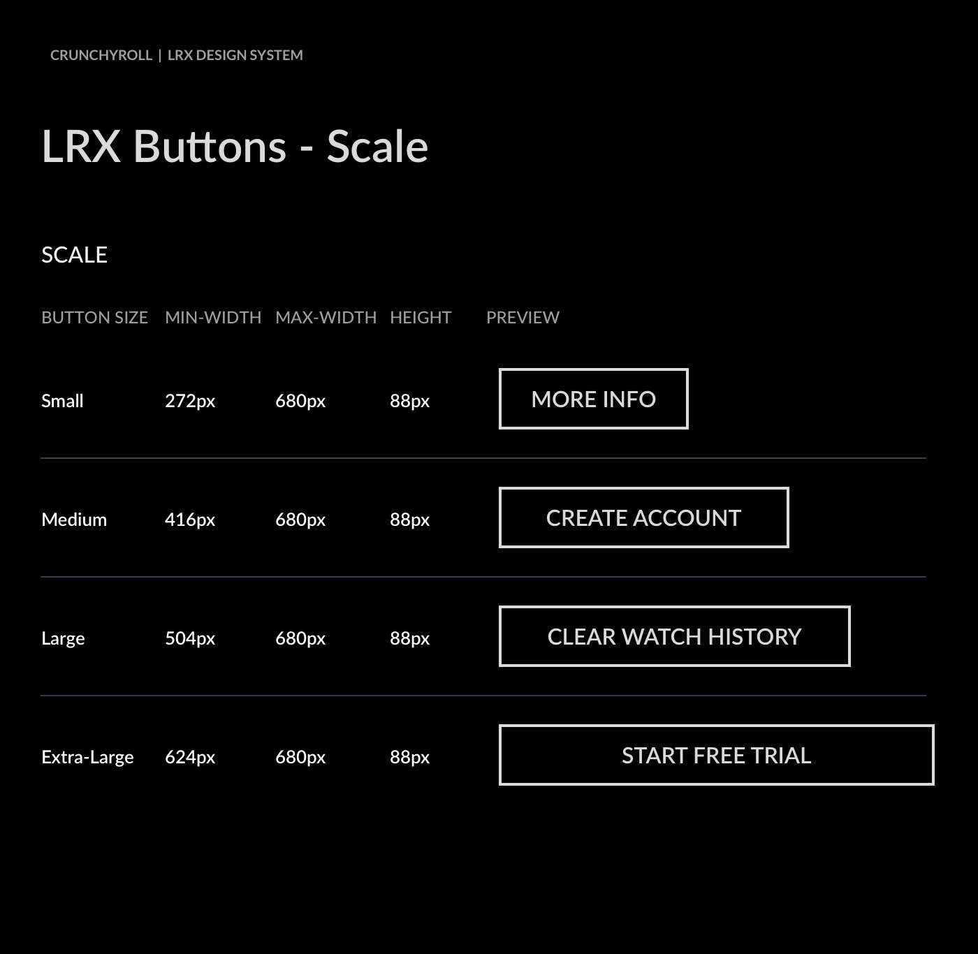
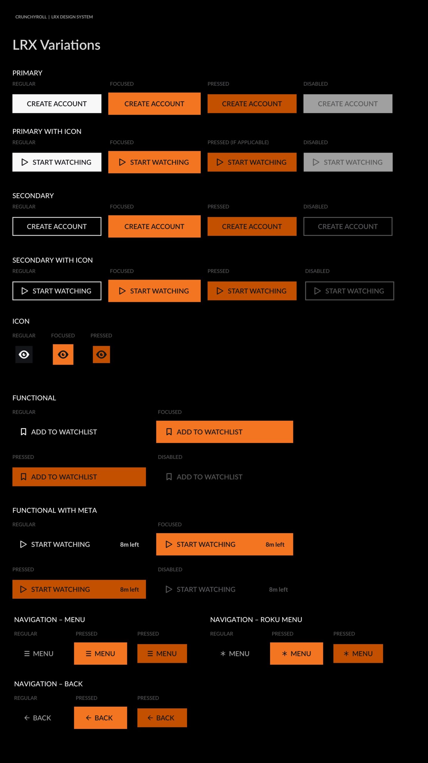
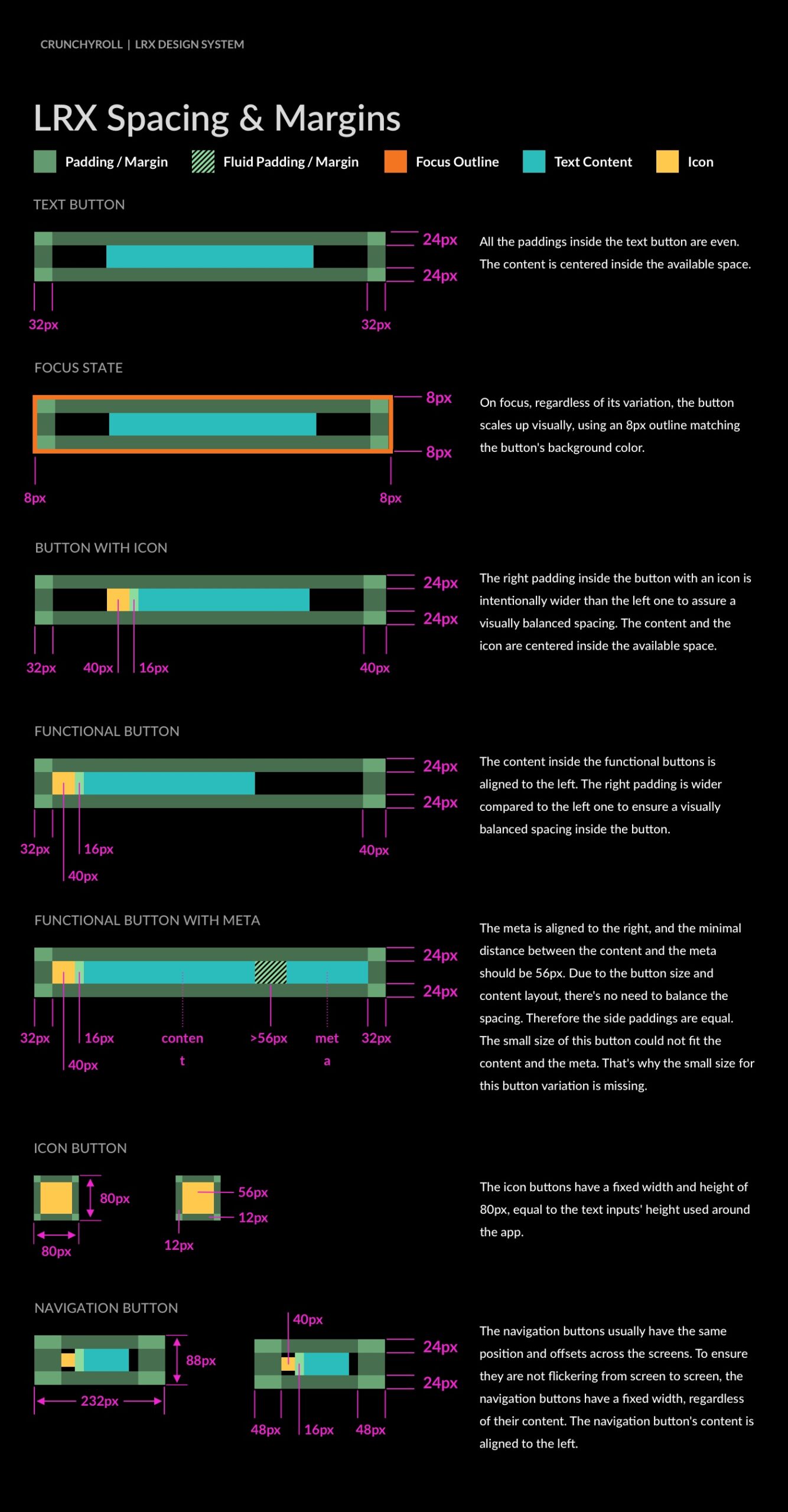
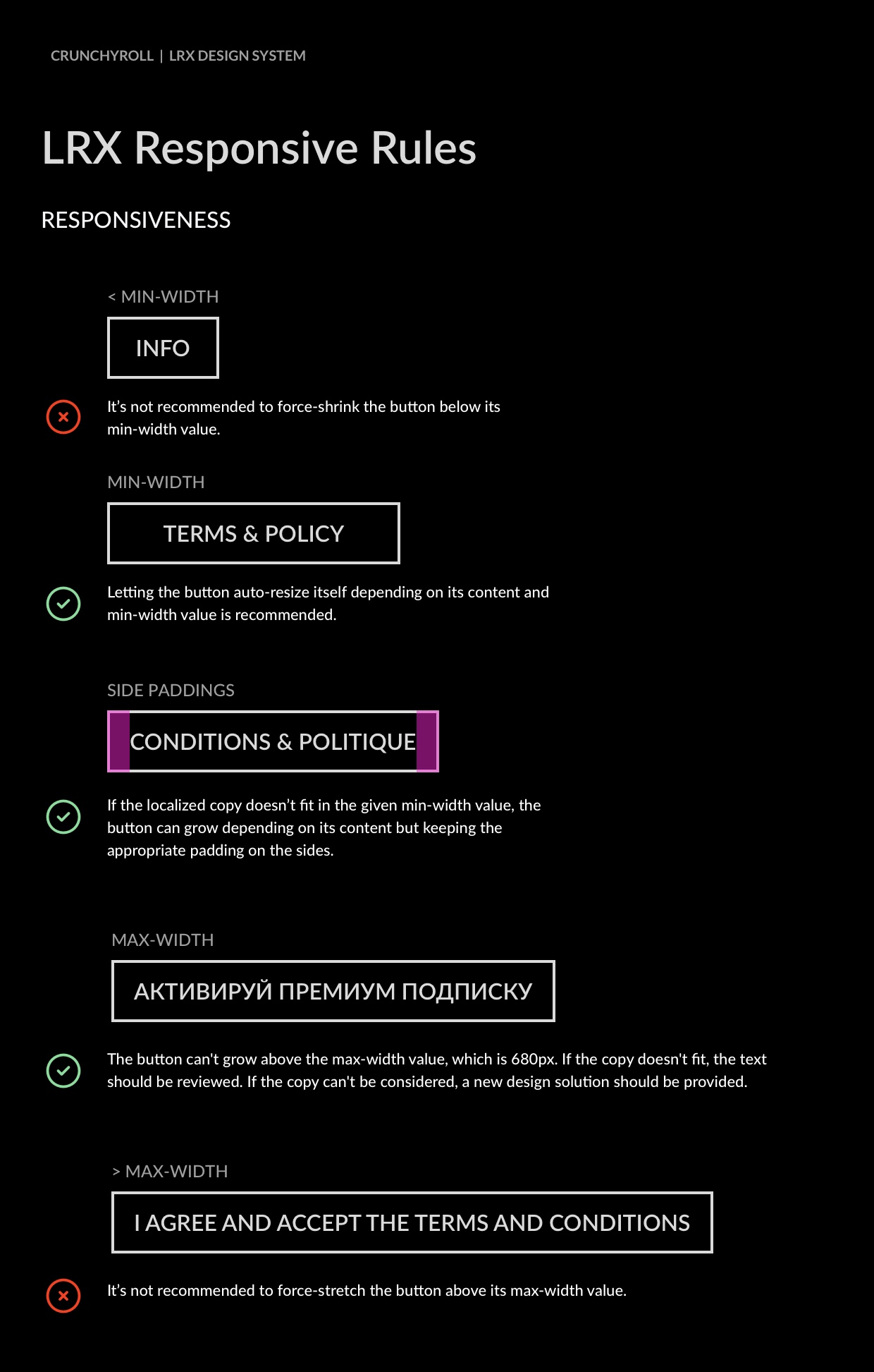
UDS Buttons
Mobile
Web
10-Foot Experience
From Design to
Development
Working closely with the development teams, we have designed a seamless workflow focused on continuous improvement, standardized documentation practices, and the cultivation and exchange of knowledge.<br>Here are a few highlights:
Component Integration
We streamlined the design workflow from Sketch to Zeplin to GitHub, ensuring consistency and efficiency.
Phased Rollout
Feasibility testing on React, iOS, and Android led to a systematic implementation, starting with the web first.
Overcoming Challenges
Negotiated naming conventions and transitioned to a unified system, reducing redundancies.
Measurable Benefits


Unified
Documentation and
Accessibility
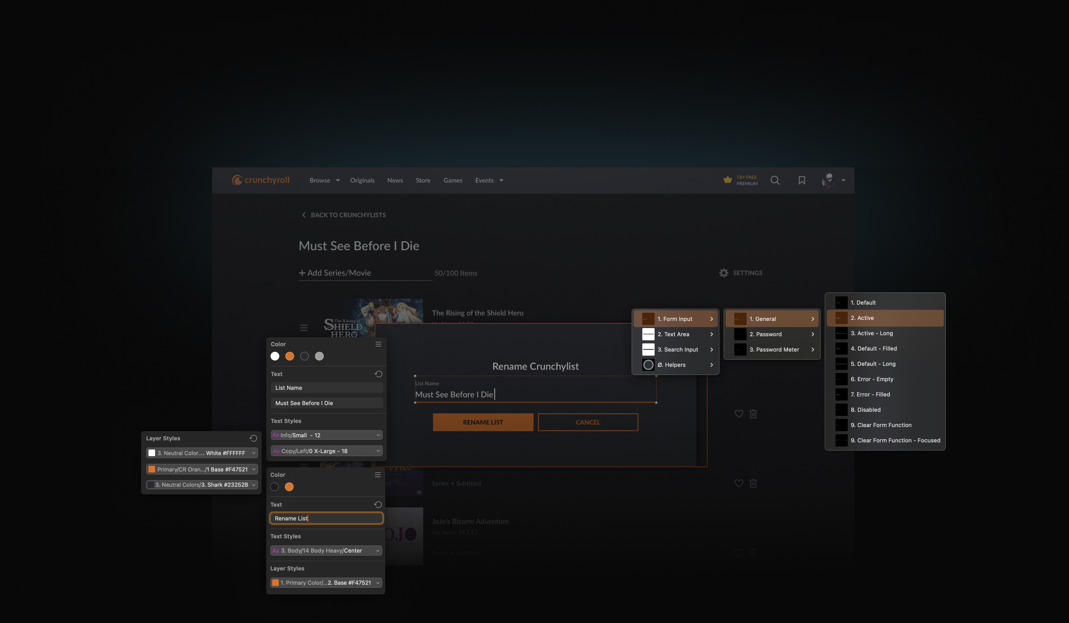
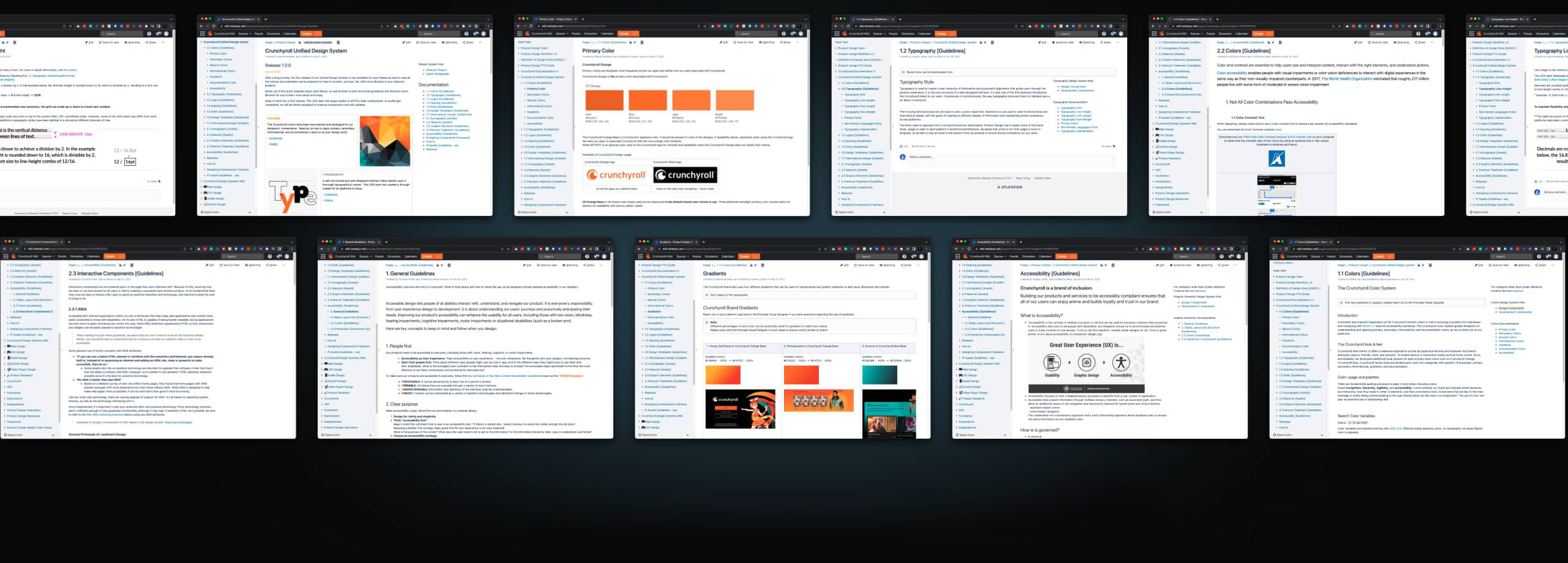
Developing a shared understanding and a unified language was quite interesting and insightful. We used Confluence as a single source of truth for coordinating design principles and guidelines.
While written documentation is essential for users to access information about design system components, brand guidelines, and principles, we also emphasized education through office hours, participation in design reviews, and training workshops. This hands-on approach ensured comprehensive understanding and adoption across the team.
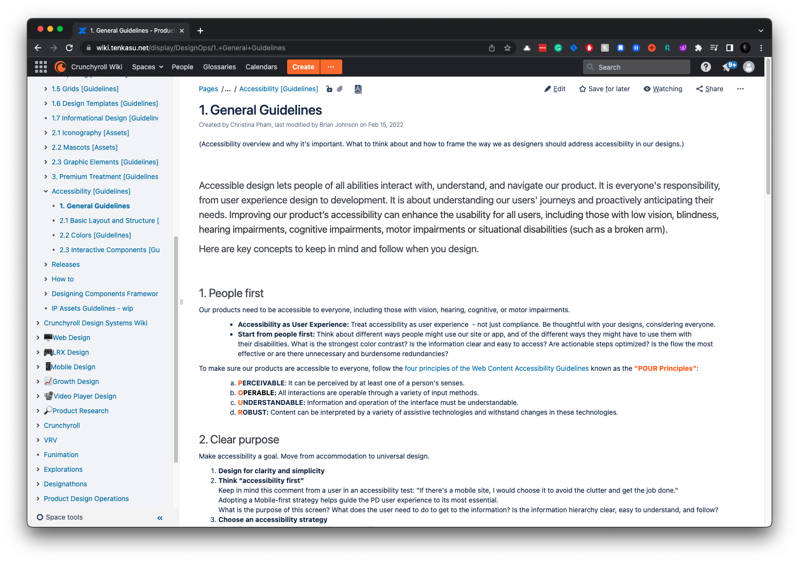
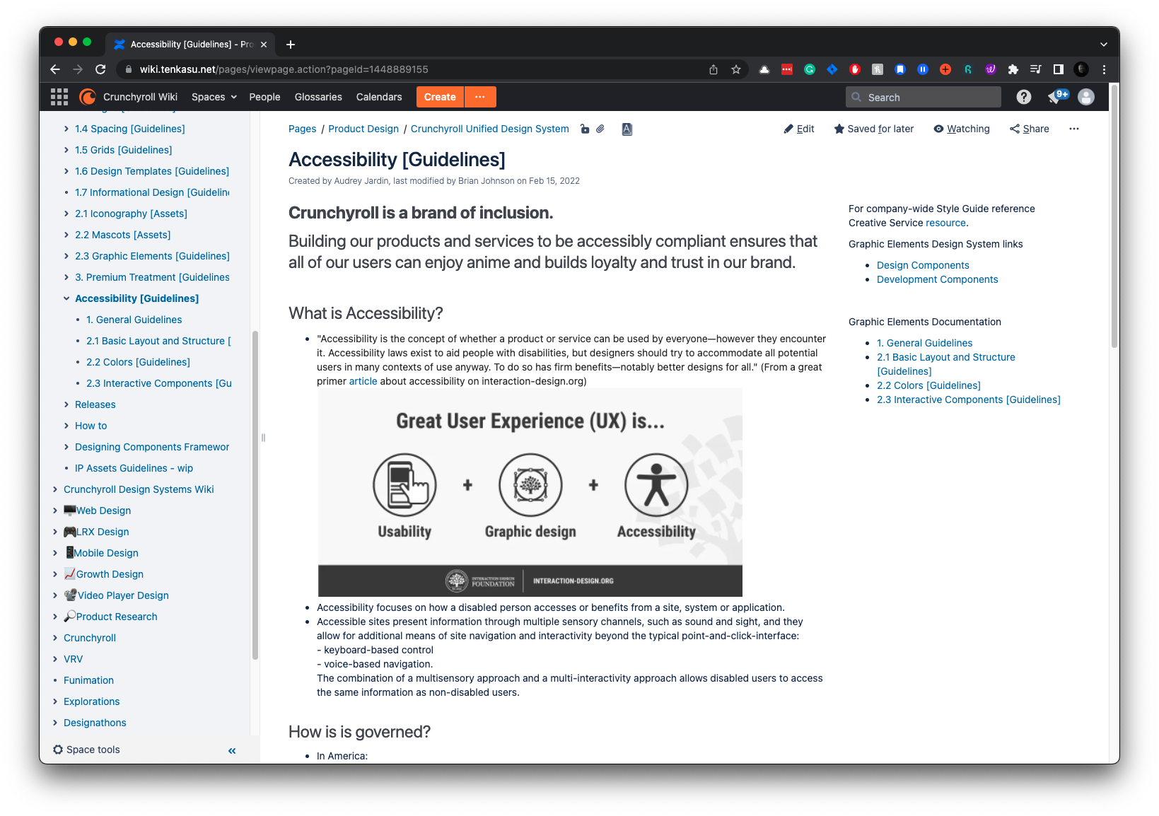
We ensured that our libraries were compliant by designing according to the WCAG 2.1 standards. This involved maintaining appropriate color contrast ratios, providing text alternatives for non-text content, and ensuring that interactive elements are navigable using a keyboard. This focus on accessibility ensures that our design system is usable by people with various limitations, fostering an inclusive user experience.
UDS Documentation
Incremental
Business Value
Implementing the Unified Design System (UDS) at Crunchyroll has provided quantitative and qualitative benefits.
Here’s a detailed breakdown of the ROI.

Accelerated
Time-to-Market*
This UDS has led to faster releases and more agile responses to market changes and user needs. With the centralized and scalable reusable system, designers delivered a new feature in 5 sprints instead of 8, resulting in a 37.5% time savings.
*Data compared to past development timelines.

Cost
Efficiency*
Implementing the UDS has resulted in an annual time savings of 15,750 hours, increasing efficiency and productivity. These savings highlight the enhanced productivity and streamlined processes brought about by the UDS.
*This figure is based on the web team, comprising three designers and eighteen developers.

Enhanced
User Experience
After implementing the UDS, the volume of support tickets decreased by an estimated 30%, reflecting a smoother and more intuitive user experience. This improvement has contributed to higher user satisfaction and retention rates, as evidenced by Crunchyroll’s growth from 7M to 9M users.
The Unified Design System (UDS) at Crunchyroll encompasses far more than what has been highlighted in this overview.
This glimpse provides a perspective on the effort, expertise, and outcomes achieved in creating the UDS. Its meticulous work has laid a strong foundation for consistent, scalable, and accessible designs.
Conclusion
Treating the UDS as an internal product proved to be a strategic decision. To ensure robust adoption and implementation, we formed several groups, including sponsors (CTO, CPO, and Senior Product Design Director), a working group (Design Managers, Lead Designers, and Developers), and future stakeholders (Creative and Marketing teams).
Creating a detailed roadmap and planning milestones paid off, providing good visibility and transparency regarding involvement and internal costs.
Extensive testing of components was invaluable; it helped us identify hidden issues early on that would have otherwise emerged much later.
Important note: Securing resources and budgets for internal tools and design systems is challenging, even in a large organization that values them. It’s a constant struggle as the immediate need to ship current work often overshadows the long-term benefits.